The Truth Is Out There
The Truth Is Out There
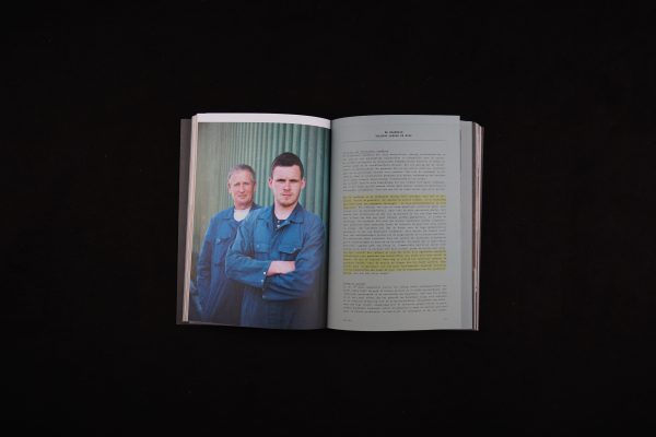
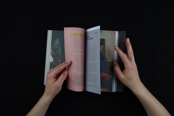
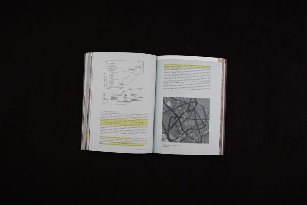
A magazine-book that portrays the world of conspiracy theories and the people behind them. In each chapter, or “case”, the visual language nicely shifts from an “alternative officiality”—by means of monospace fonts, dull-coloured paper, and highlights—to more casual and friendly magazine spreads. The designers initiated this project together with a researcher, and this collaborative effort is clearly observable. The general layout seems to be decided from both a visual and reading standpoint as well as a research method standpoint.
Each chapter has varying page sizes, so that each page shows a bit of the next. This gives the feeling of uncovering something and finding secret knowledge. It also functions to section the separate chapters, much like dividers in a file folder. Some of the typographic choices and typesetting per chapter could be perfected in order to create a more solid and coherent atmosphere.
It was very refreshing and inspiring to see a crowdfunded publication in the submissions. Some of the technical details are a bit rough around the edges, and the varying pages do not feel sharply cut.
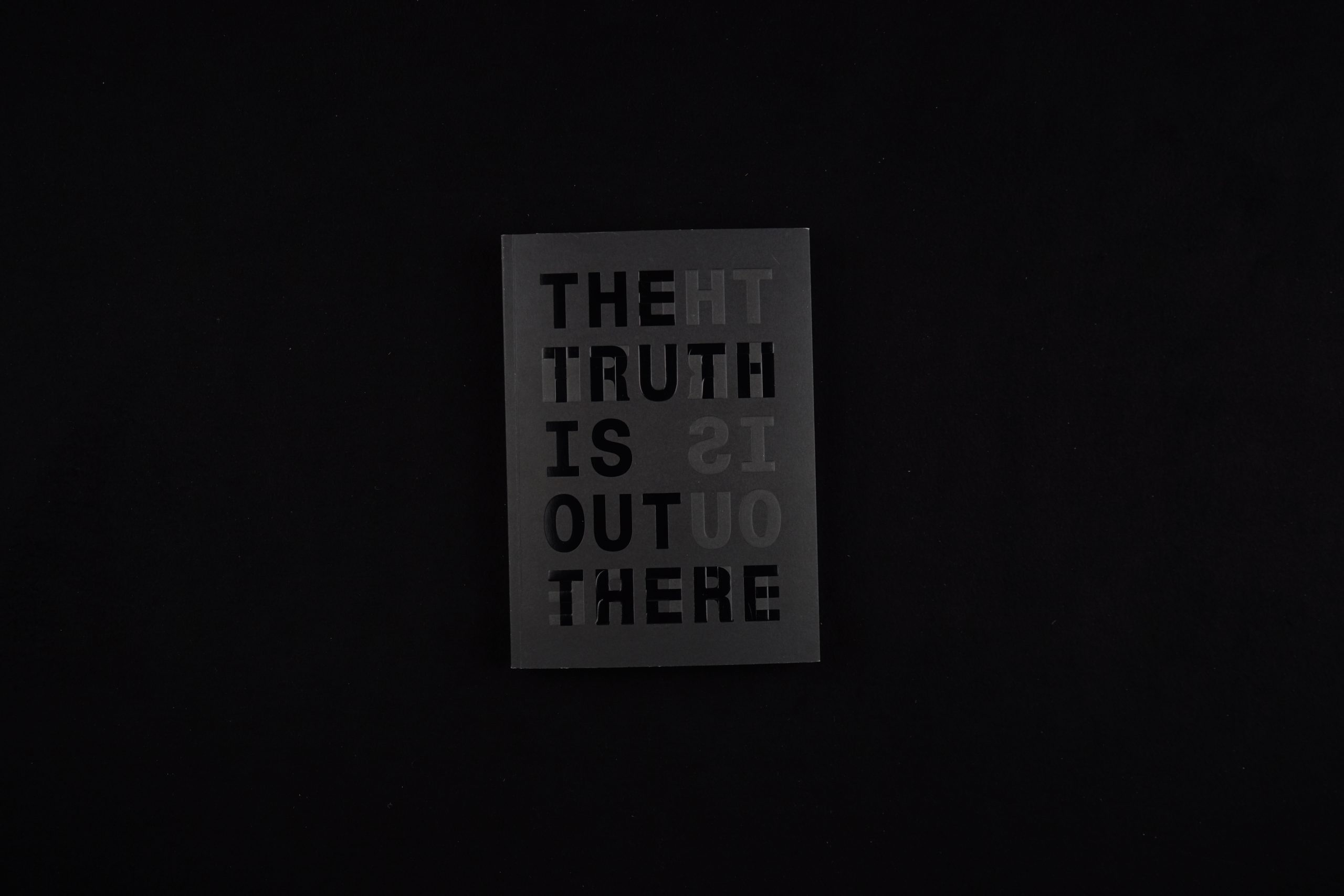
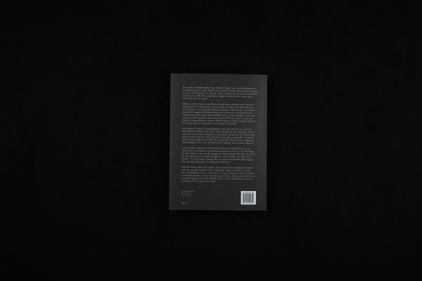
The publication is presented in a black stock cover, which presents the text in its main direction (white and flat) and in a mirrored version (glossy, varnish, embossed). When you open the cover, the mirrored text shows to be in the main reading direction again. On the side, you find the full title, ‘THE TRUTH IS OUT THERE’, which whispers to you in glow-in-the-dark when placed on the bedside.
- Auteur
- Jaron Harambam, Marije Kuiper, Roel Vaessen
- Kunstenaar
- Roel Vaessen
- Serie
- No
- Oplage
- 8500
- Omvang
- 320
- Prijs
- € 24,99
- ISBN
- ISBN 978 90 214 4080 4 / NUR 740
- Uitgever / Opdrachtgever
- VOLT, Singel Uitgeverijen
- Ontwerper(s)
- Roel Vaessen (Den Bosch)
- Fotograaf
- Marije Kuiper
- Drukkerij
- NPN Drukkerij Breda
- Lithograaf
- NPN Drukkerij Breda
- Boekbinderij
- NPN Drukkerij Breda
A magazine-book that portrays the world of conspiracy theories and the people behind them. In each chapter, or “case”, the visual language nicely shifts from an “alternative officiality”—by means of monospace fonts, dull-coloured paper, and highlights—to more casual and friendly magazine spreads. The designers initiated this project together with a researcher, and this collaborative effort is clearly observable. The general layout seems to be decided from both a visual and reading standpoint as well as a research method standpoint.
Each chapter has varying page sizes, so that each page shows a bit of the next. This gives the feeling of uncovering something and finding secret knowledge. It also functions to section the separate chapters, much like dividers in a file folder. Some of the typographic choices and typesetting per chapter could be perfected in order to create a more solid and coherent atmosphere.
It was very refreshing and inspiring to see a crowdfunded publication in the submissions. Some of the technical details are a bit rough around the edges, and the varying pages do not feel sharply cut.
The publication is presented in a black stock cover, which presents the text in its main direction (white and flat) and in a mirrored version (glossy, varnish, embossed). When you open the cover, the mirrored text shows to be in the main reading direction again. On the side, you find the full title, ‘THE TRUTH IS OUT THERE’, which whispers to you in glow-in-the-dark when placed on the bedside.
- Auteur
- Jaron Harambam, Marije Kuiper, Roel Vaessen
- Kunstenaar
- Roel Vaessen
- Serie
- No
- Oplage
- 8500
- Omvang
- 320
- Prijs
- € 24,99
- ISBN
- ISBN 978 90 214 4080 4 / NUR 740
- Uitgever / Opdrachtgever
- VOLT, Singel Uitgeverijen
- Ontwerper(s)
- Roel Vaessen (Den Bosch)
- Fotograaf
- Marije Kuiper
- Drukkerij
- NPN Drukkerij Breda
- Lithograaf
- NPN Drukkerij Breda
- Boekbinderij
- NPN Drukkerij Breda