Kill the Pig
Kill the Pig
A very poetic and shocking photography piece that draws an analogy between life and death.
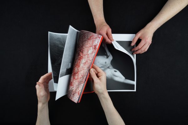
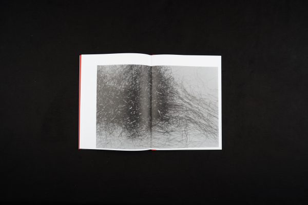
The two worlds are separated in each end of the book, portraying two different main characters. The arrangement of the images sets a capturing rhythm between the details of complexion and the broader sense of the surroundings. This further induces the feeling that there is no distinction between life, love, or death, but that they all flow in and out of each other.
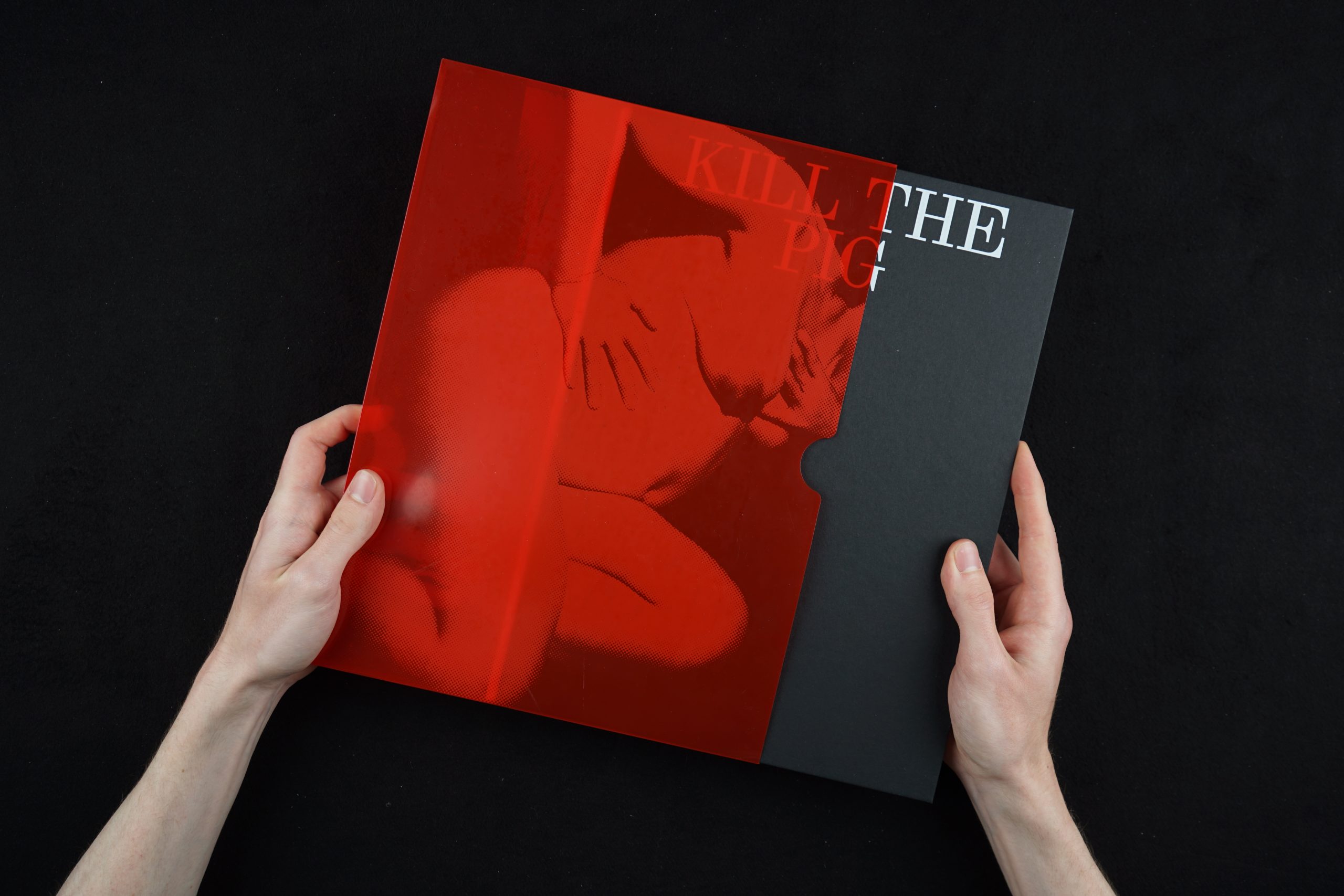
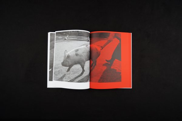
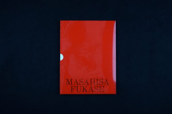
The choice of monochrome photography creates a darker atmosphere. There are only two photographs that implement colour, and they depict the slaughterhouse. However, the only colours used are red and some shades of yellow, which instead of brightening the scenes amplify the feeling of sickness, distress, and brutality. The red colour is a common thread of the book which reminds viewers of the running blood in both storylines. It is used primarily in the middle section, where the two segments meet, and more is revealed through textual narrative. The paper has been intentionally selected to resemble pigskin, drawing the viewer even closer to the stories.
The hard covers, rough to the touch, contrast with the soft pages, as well as the smooth silky sleeve coming on top, creating new layers of beautiful visuals. This tactile character of the book, the softness opposed to the roughness, together with the use of colours, create a full experience of this brutal but tender narrative.
- Auteur
- Tomo Kosuga
- Kunstenaar
- Masahisa Fukase
- Serie
- No
- Oplage
- 1025
- Omvang
- 84
- ISBN
- 979-10-95424-27-7
- Uitgever / Opdrachtgever
- Parijs , Antwerpen
- Ontwerper(s)
- Mainstudio / Edwin van Gelder (Amsterdam), Mainastudio / Christian Knopfel (Amsterdam)
- Fotograaf
- Masahisa Fukase
- Drukkerij
- drukkerij robstolk
- DTP / Zetterij
- Mainstudio
- Lithograaf
- drukkerij robstolk
- Boekbinderij
- boekbinderij van Mierlo
- Lettertype
- Synt (Dinamo), DNP Shueitai
A very poetic and shocking photography piece that draws an analogy between life and death.
The two worlds are separated in each end of the book, portraying two different main characters. The arrangement of the images sets a capturing rhythm between the details of complexion and the broader sense of the surroundings. This further induces the feeling that there is no distinction between life, love, or death, but that they all flow in and out of each other.
The choice of monochrome photography creates a darker atmosphere. There are only two photographs that implement colour, and they depict the slaughterhouse. However, the only colours used are red and some shades of yellow, which instead of brightening the scenes amplify the feeling of sickness, distress, and brutality. The red colour is a common thread of the book which reminds viewers of the running blood in both storylines. It is used primarily in the middle section, where the two segments meet, and more is revealed through textual narrative. The paper has been intentionally selected to resemble pigskin, drawing the viewer even closer to the stories.
The hard covers, rough to the touch, contrast with the soft pages, as well as the smooth silky sleeve coming on top, creating new layers of beautiful visuals. This tactile character of the book, the softness opposed to the roughness, together with the use of colours, create a full experience of this brutal but tender narrative.
- Auteur
- Tomo Kosuga
- Kunstenaar
- Masahisa Fukase
- Serie
- No
- Oplage
- 1025
- Omvang
- 84
- ISBN
- 979-10-95424-27-7
- Uitgever / Opdrachtgever
- Parijs , Antwerpen
- Ontwerper(s)
- Mainstudio / Edwin van Gelder (Amsterdam), Mainastudio / Christian Knopfel (Amsterdam)
- Fotograaf
- Masahisa Fukase
- Drukkerij
- drukkerij robstolk
- DTP / Zetterij
- Mainstudio
- Lithograaf
- drukkerij robstolk
- Boekbinderij
- boekbinderij van Mierlo
- Lettertype
- Synt (Dinamo), DNP Shueitai