EMA (NAAKT OP EEN TRAP) / EMA (NUDE ON A STAIRCASE)
EMA (NAAKT OP EEN TRAP) / EMA (NUDE ON A STAIRCASE)
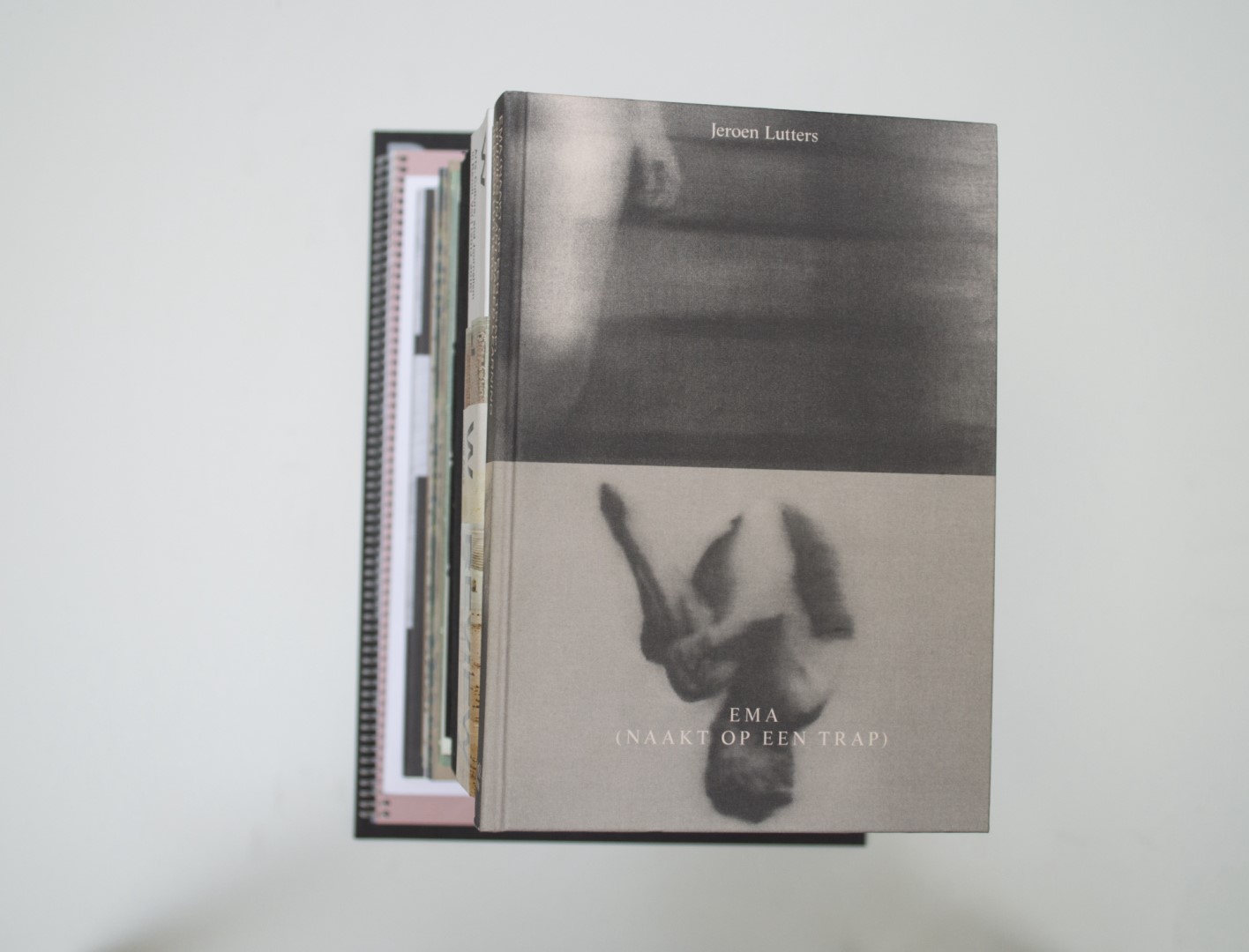
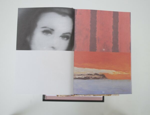
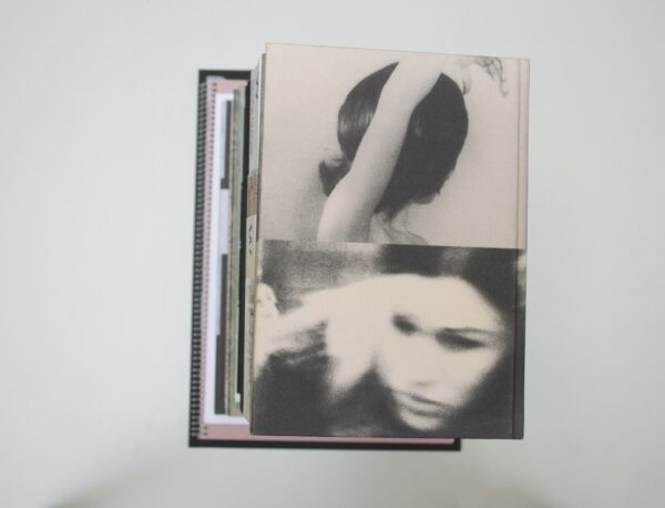
Malin: Ema? Who is this? I don’t know, but the cover feels nice. Let’s take a look inside. Strange, but somehow interesting. The layout of the spreads is divided into four. The images remind me of still frames – the captions on the images give the impression of subtitles. I slowly understand that these are no movie stills, and who Ema is: she is the protagonist of one of Gerhard Richter’s 1966 paintings. The book illustrates a fictitious dialogue between Ema and her master. Unconventional literary approach meets unconventional design. This book makes me curious!
Ruby: I have a hard time making up my mind about this one. Initially I wasn’t attracted to the object at all. At first I considered it rather romantic in an old fashioned, feminine kind of way that was hard for me to access. Then when we were discussing the book and the other judges were sharing their opinions of it, I started to see stuff that I probably never would have picked up on myself, and by the end could appreciate it. That’s one of the things I loved about hearing what other people had to say about the books; at times it felt as if I was learning to see again, through someone else’s eyes.
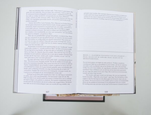
Malin: At first I was also a bit suspicious about the idea of a woman (in this case the image of a woman) meeting her “master”. Since it is in Dutch I can not entirely grasp the content, but if I got it right it ends with Ema empowering herself from her master (the male view?).
Birgit: I like your statement about seeing the books through other people’s eyes, Ruby! This book intrigued me immediately but I felt some of you knew how to put my fascination into words better than I could myself.
Auke: Interesting way of visualizing the thoughts of Ema. The way the visuals are connected to her thoughts and specific art pieces are designed into this four divided layout. I can’t really pinpoint what it is that interests me so much about this book. It has a very harmonious vibe. There is this grey tone that starts on the cover and continues throughout the whole book. That to me represents the world of the psyche and in the end that’s where this story takes place, right?
Patrick: First of all, the cover feels great – the smooth structure on the hard cover. The horizontal line that divides the book is consistently implemented and provides a fine structure.
- Auteur
- Jeroen Lutters
- Oplage
- 1000
- Omvang
- 206
- Prijs
- 29,50
- ISBN
- 978 94 91444 36 4 (NL) / ISBN: 978 94 91444 36 0 (ENG)
- Uitgever / Opdrachtgever
- ArtEZ Press, Arnhem; productie door Tim Beijer Producties, Utrecht
- Ontwerper(s)
- Amir Avraham, Amsterdam
- Lithograaf
- Colour & Books, Apeldoorn (Sebastiaan Hanekroot).
- Materiaal
- Linnen cover


