CROWN HALL DEAN’S DIALOGUES
CROWN HALL DEAN’S DIALOGUES
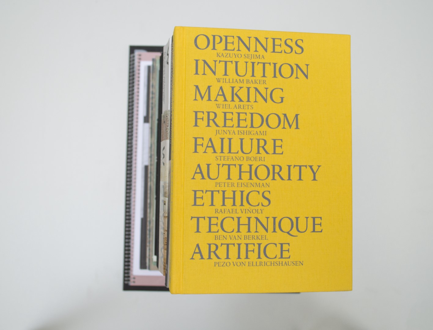
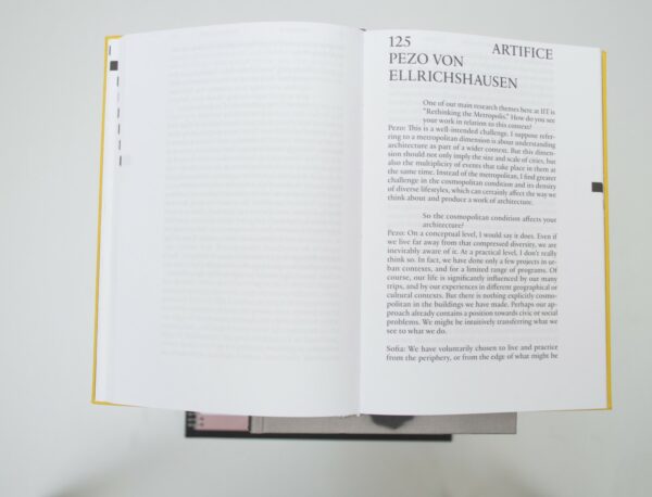
Patrick: What make this book special are the clear choices and the hard implementation of them. The content consists of a collection of essays. The table of contents is made visually on the cut, making the various essays easy to find. The essays are about architecture and this architectural feeling is very clear in the way the book is designed. You can very clearly feel the grid that has been used to set the text. The images are printed with silver and black and that works very well.
Birgit: Another textbook! Again, the quality of the typography and design choices are what made this book a BVB for me. As Patrick says, it’s nice to see the references to architecture visualized in the image placement and typography. The simple cover works for me as well.
Ruby: Nice paper, beautiful type, inviting to read! A simple formula that worked out very well.
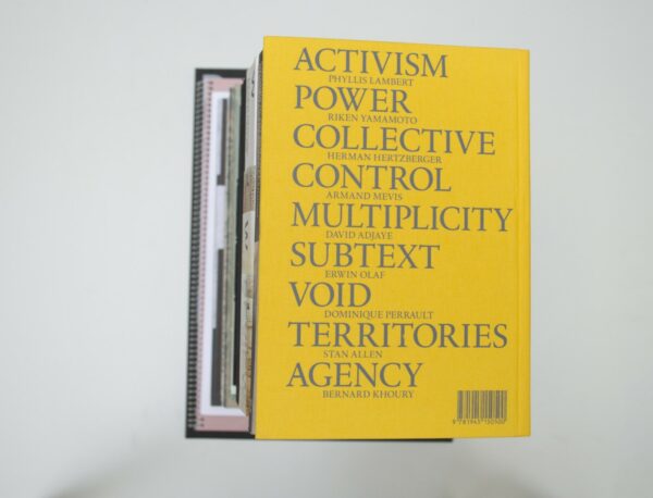
Auke: Funny that you like the chapter dividers now, Patrick. I remember we didn’t like them as much in Facing Value. I’m still not a fan, although I think they’re better implemented here and less shrieking. There is something I don’t like about the cover, index and titles. This all-caps serif looks a bit awkward to me. I think it does not suite these letters to be used in this way – certainly not this repetition on the cover. First, the big all-caps title; to then put the same all-caps subtitle, but smaller, looks really stiff. This, in combination with the yellow, makes the book remind me of a telephone book. For the rest, it’s a very decent book. But a BVB? Not for me.
- Auteur
- Wiel Arets, Agata Siemionow
- Oplage
- 2500
- Omvang
- 300
- Prijs
- 30
- ISBN
- 978 1 9451 5050 0
- Ontwerper(s)
- Mainstudio (Edwin van Gelder), Amsterdam
- Drukkerij
- UNICUM | Gianotten Printed Media, Tilburg
- Lithograaf
- Gerrie Van Beek, Tilburg
- Boekbinderij
- Boekbinderij Van Mierlo, Nijmegen
- Materiaal
- Paper for interior: 90gsm Munken Lynx Rough. Cover: Brillianta Calandré/Van Heek Textiles
- Lettertype
- Practice, Optimo foundry
- Technische Bijzonderheden
- binding with 1 mm board stamped with grey matt foil. Two markers.


