HEARINGS: A READER
HEARINGS: A READER
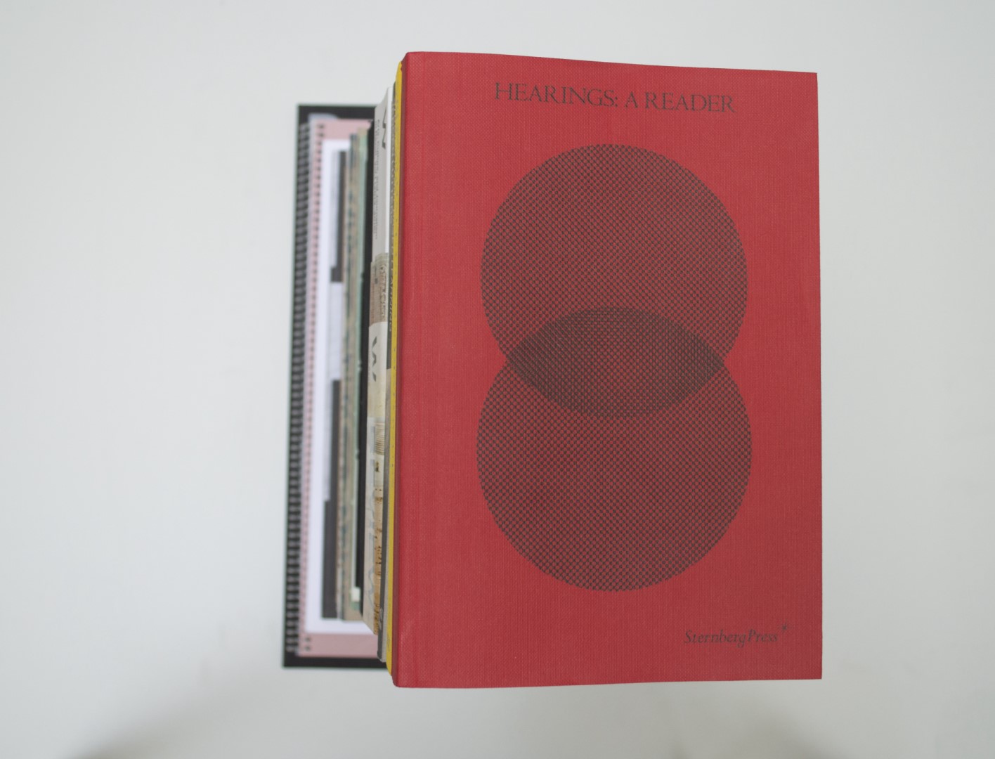
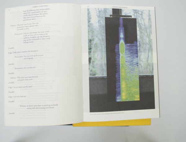
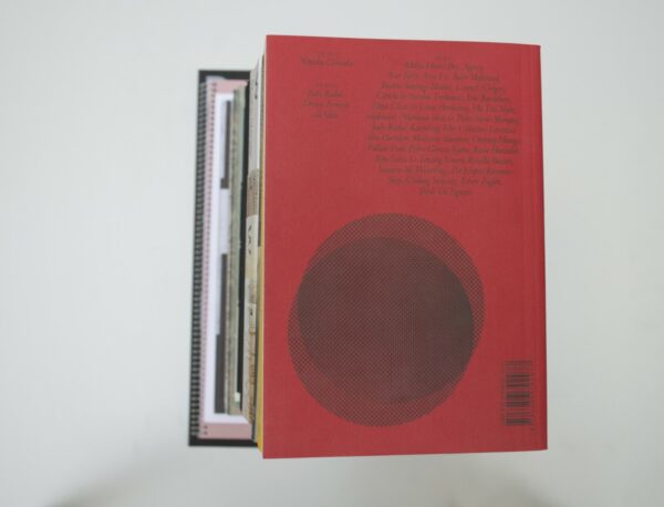
Patrick: When you pick up the book, it feels very comfortable in your hand, is lightly weighted and the right size. The cover paper (Wibalin Buckram Ruby) is very thin for a cover and fits perfectly with the light feeling that the book has. Although it is a book of predominantly text, every page is nice and surprising to see. The tight margin creates tension and the many footnotes and references are designed in a subtle way, in a small font size, and with that they let the pages live. The distinction between the different types of texts was made by dealing with the tabs or air columns.
Auke: I agree, Patrick. Material-wise it’s a very airy book (not sure if I use the word “airy” correctly). Everything is designed in a very modest way. You would almost say it’s simple, but the devil is in the details! The combination and treatment of the typefaces are well done. I get really calm when I see how the navigation, titles, subtitles, page numbers and body text are handled. They relate to each other in a very coherent way, and are very satisfying to look at.
Ruby: When we were discussing this book we found it hard to say a lot about it. The main thing all of us mentioned was that it just feels very nice and light to hold. I love the paper choice, and the way the text is typeset is plainly solid. Maybe it’s just a no frills winner.
Birgit: Can I just agree with all of you here? It’s very satisfying to look at this book and the details are all well-thought-out.
- Auteur
- Natasha Ginwala (ed.) in collaboration with Krisztina Hunya, Katelijne Lindemans.
- Oplage
- 1000
- Omvang
- 248
- Prijs
- 20
- ISBN
- 978 3 95679 297 7
- Uitgever / Opdrachtgever
- Sternberg Press, Berlin (DE)
- Ontwerper(s)
- Studio Remco van Bladel, Amsterdam (Remco van Bladel, Beau Bertens, Berit Smit)
- Drukkerij
- Drukkerij Raddraaier, Amsterdam
- Boekbinderij
- Boekbinderij Patist, Den Dolder.
- Materiaal
- Paper for interior: 80gsm FocusBook Naturel 2.0 (Papyrus). Cover: 115gsm Wibalin Buckram 530 Ruby (Winter&Company)
- Bindwijze
- Sewn Patabind with flaps, using red threads
- Lettertype
- Centaur Pro (Monotype), Memphis Pro (Linotype)


