
WDW REVIEW: ARTS, CULTURE AND JOURNALISM IN REVOLT
WDW REVIEW: ARTS, CULTURE AND JOURNALISM IN REVOLT
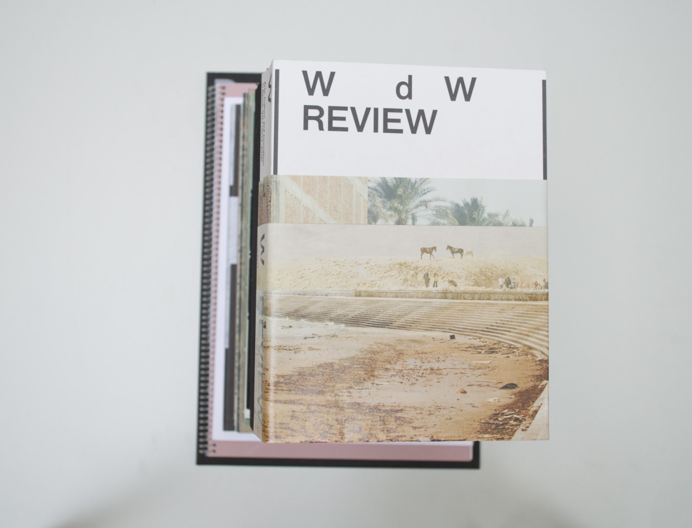
Ruby: I was initially attracted to the cover of this book: a simple white cover with black typography that is wrapped by a folded dust cover. When I took it off, I saw that it was printed on both sides, with coloured photographs of what seems to be a sahara-like setting. The dust cover is shorter than the book and still reveals part of the white cover. The book contains three different coloured papers, that divide sections. I enjoy the proportions of the book, and I’m encouraged to read the text because it feels so comfortable looking at it.
Auke: Yes yes Patrick. I said I didn’t like this book in the beginning. I just needed some time to take everything in. When you take the dust cover off, the cover kind of reminds me of Pool 1, but more refined. A lot of decisions being made in this book are refined. As a matter of fact, this is a BVB. A printed collection of essays, cartoons and image reflections that were published on Witte de With’s online platform WdW Review. Very well-made choices considering the many different papers that this book consists of. This book stays open nicely and the tactility of the pages is great. Typography-wise, it is set really nicely. Funky index, nice navigation and footnotes, modest but clear. The text simply invites you to read it and keep reading it.
Patrick: The total typographic white cover in combination with the half dust jacket creates a nice image and that makes me look into this book. The way typography is set makes you want to read and the pages do not get boring. The book feels like a nice solid block in your hand.
Birgit: I really liked this book from the start. The dust cover is folded quite ingeniously and works with the inside of the book. As my fellow jurors point out, the book’s proportions, typography, section dividers and different materials all work quite well.
- Auteur
- Defne Ayas, Adam Kleinman (eds.)
- Oplage
- 1000
- Omvang
- 668
- Prijs
- 29
- ISBN
- 978 94 91435 47 8
- Uitgever / Opdrachtgever
- Witte de With Center for Contemporary Art, Rotterdam
- Ontwerper(s)
- Studio Remco van Bladel, Amsterdam (Remco van Bladel, Beau Bertens, Berit Smit, Andrea Spikker)
- Drukkerij
- UNICUM | Gianotten Printed Media, Tilburg.
- Boekbinderij
- UNICUM | Gianotten Printed Media, Tilburg.
- Materiaal
- Paper for interior: 85gsm Arcoprint Milk 1.5 (Fedrigoni), 85gsm Arcoprint Edizioni 1.3 Avorio (Fedrigoni), 70gsm UPM Sol Mat (Igepa). Cover: 300gsm Arcoprint Milk 1.5 (Fedrigoni). Dust jacket: 80gsm Etibulk (Igepa).
- Bindwijze
- sewn soft cover using black threads, dust jacket.
- Lettertype
- F Grotesk (RP Digital Type Foundry), Lyon Display (Colophon Foundry
- Technische Bijzonderheden
- asymmetrical zigzag folded jacket.