IN SITU
IN SITU
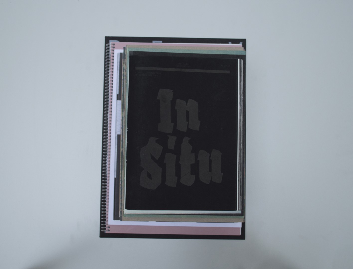
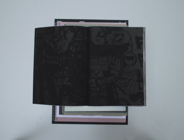
Birgit: This book is about the underground music scene of The Hague. You could think of a lot of shapes that such a book should have, but none would be the one that is chosen here. This makes it an interesting book. At first glance it has an expensive appearance, but when you look closer the rawness seeps through. In contrast to the almost-velvet paper, the booklet is bound together in one fold and is left uncut. At first it feels heavy and important but the ink and paper that are used leave your hands feeling a bit grimy at the end – a great metaphor for the photos that are shown in the book. Showing a lot of party scenes that are quite often a bit dirty as well, they really translate what this underground scene might feel like.
Ruby: I do not have this immediate expensive connotation that you mention, Birgit. Sure, the book is made out of nice paper, but the binding isn’t done in a very complicated or expensive way. It’s just a stack of risograph A4, folded in half and binded by pulling a thread through the spine. I especially enjoy the extreme black and white contrast in the photographs and the white and black sheets of paper. I find the book a good translation of the vibe of the scene.
Auke: I agree with Ruby. To me, the inner work conveys the underground vibe. It could be the case that Birgit is right, but I’m not an underground expert. The blackletter clashes with the rest of the text. But I really appreciate that this book was put together or published by someone from the actual scene, who would normally have nothing to do with books at a professional level.
Patrick: The ‘zine’ vibe that this book has worked very well. The images are nicely rough and the paper reinforces that very much. The black print on black paper made me want to look at it longer. A point of criticism is that the thick cover and the large calligraphic letter try to make it look like a real book while the feeling of a zine works very well.
- Auteur
- Bertus Gerssen
- Oplage
- 300
- Omvang
- 180
- Prijs
- 27,50
- Uitgever / Opdrachtgever
- Bertus Gerssen
- Ontwerper(s)
- We-Are-Amp, The Hague
- Fotograaf
- Bertus Gerssen
- Drukkerij
- Stencilwerck, Den Haag
- Boekbinderij
- Epping Boekbinders, Woerden
- Materiaal
- Paper for interior: 130gsm The Tube black Favini (Igepa). Dust jacket: 340gsm The Tube black Favini (Igepa), 100gsm Biotop 3 Next Naturel (Igepa).
- Lettertype
- Fakir (Underware), Nimbus Mono (URW++ Design and Development GmbH)
- Technische Bijzonderheden
- the book consists of one section using the Risograph process; binding uses black threads. The combination of black and white paper has been used as a reference to the underground music scene in The Hague. The format of the book is a zine which fits the underground scene as well.


