THE QUEEN OF THE ANIMALS AND MOST BEAUTIFUL GARDENS
THE QUEEN OF THE ANIMALS AND MOST BEAUTIFUL GARDENS
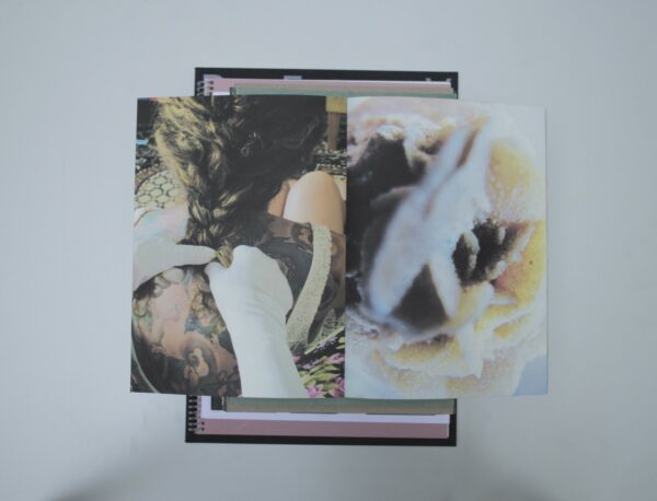
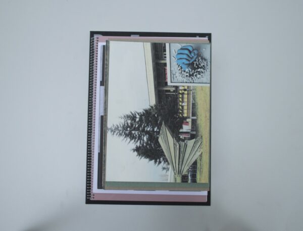
Malin: This photo book presents pictures of someone on the search of their own identity. The interesting combination of images (full bleed on every spread) gives room for interpretations. This book has a nostalgic touch to it. You can feel it when running your fingers over the pages. And of the colours are so active. What printing technique is this? I don’t know, but I like it!
Ruby: This publication feels very personal, almost as if you are given the rare opportunity to look into the family album of someone you’ve just met and know nothing about. Indeed, as Malin mentioned, it has nostalgic qualities. I was especially impressed by the fact that the makers were able to work with this nostalgic vibe without taking it that step too far where it becomes corny. They treated the material very carefully, and there is very little ‘design’ to it. They let the material speak for itself and it works beautifully. It leaves a lot up to the imagination. Sometimes very little is just enough.
Birgit: Though I didn’t really feel the same connection to this book as Malin and Ruby did, I did find it quite fascinating to see how different books speak to different people. It made me think about the subjectivity of judging books and how glad I was to be judging with this diverse group of people.
Patrick: The combination of the images makes you think: What do they have to do with each other? What do they try to tell you? It’s nice that the designer did not try to put herself in the foreground but literally gave all of the space to the images.
Auke: It indeed looks very personal. The handwritten text also enhances this feeling. The book needs as little design as it has. The grainy paper won’t make the pictures more beautiful than they are. On the other hand, bright colors, as those it was printed in, sometimes make a picture more lively. It’s almost like real life, with ups and downs.
- Auteur
- Hristina Tasheva
- Oplage
- 114
- Omvang
- 128
- Prijs
- 40
- Uitgever / Opdrachtgever
- Hristina Tasheva, Bodegraven
- Ontwerper(s)
- The Visual Theatre (Emmy van Thiel), Rotterdam
- Fotograaf
- Hristina Tasheva
- Drukkerij
- Charles Nypels Lab, Maastricht
- Lithograaf
- Hristina Tasheva
- Boekbinderij
- Charles Nypels Lab, Maastricht
- Materiaal
- Paper for interior: 120gsm Biotop (Mondi Group). Cover: 250gsm Biotop (Mondi Group)
- Lettertype
- Roboto Condensed, Google Fonts
- Technische Bijzonderheden
- Special features: first printed on a Comcolor printer (inkjet with soy ink), then using the Risograph process. All copies are numbered.


