CLOUD INVERSE
CLOUD INVERSE
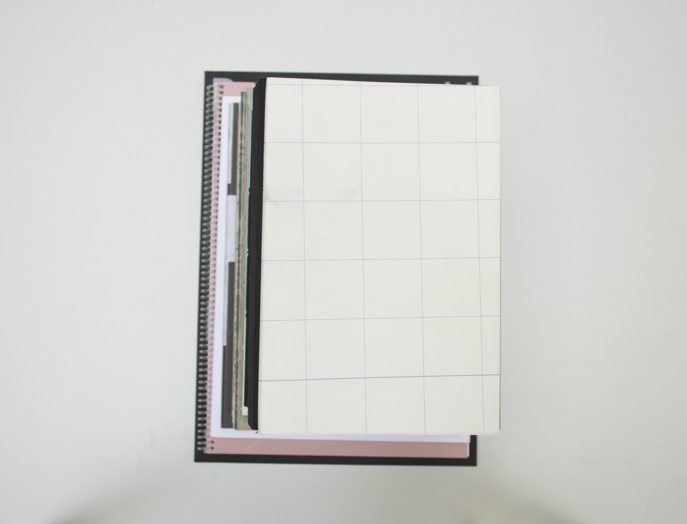
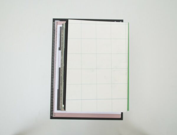
Birgit: Somehow this book didn’t make it to our top 30 immediately. As it is a small, delicate book, with a simple grid as a dust jacket, it got lost between all of the big, bulky books screaming for our attention. Luckily, at some point, Malin did find it and pointed it out to us. Then most of us did a complete 180 on the book. It’s about Vibeke Mascini’s journey to the top of Mont-Blanc and every detail has been carefully construed with meaning. From the stone paper used for the cover, to the walking map design. In the book itself, an analogy between walking and writing is used where the footnotes represent footprints. a mountain feels, with a clear view. I like the fact that even though the book is very well designed it never becomes too official; it still feels like someone’s personal travel diary.
Ruby: I remember my attention being brought to this book, and I was definitely one of the people that did a 180 on it, Birgit. The book is filled with smart yet delicate design choices. The stone paper jacket with a wide grid folds out into a map without references. The design and typography are done in a manner that leaves lot’s of space. Exactly how you would imagine walking to the top of a mountain feels, with a clear view. I like the fact that even though the book is very well designed it never becomes too official; it still feels like someone’s personal travel diary.
Auke: Stonepaper: one of the most satisfying things you will ever touch. I think this is a fun book. It’s not A4, but the they used the same margins as in a standard word document. The footnotes are small and placed at the bottom and the images stay within the text frame. Only in this case the maker has a sense for typography. That’s also why I do think – unlike Ruby – that it does feels quite official, almost scientific. And that’s not a bad thing. All of this makes me believe this story is more real, which I think is nice in this case.
Patrick: The choice for the stone paper is very good – both aesthetically and conceptually. The graphs feel a bit unrefined by the full surfaces. The subtleties in the choice of paper could, in my opinion, have been allowed to be implemented more in typography and graphs.
- Auteur
- Vibeke Mascini
- Oplage
- 250
- Omvang
- 94 + 2 fold-outs
- Prijs
- 40
- ISBN
- 978 90 824484 1 2
- Uitgever / Opdrachtgever
- Vibeke Mascini
- Ontwerper(s)
- Paul Gangloff, Amsterdam, Vibeke Mascini, Amsterdam/Brussel.
- Fotograaf
- Vibeke Mascini, Paul Gangloff
- Drukkerij
- Drukkerij Raddraaier, Amsterdam
- Boekbinderij
- Handboekbinderij Geertsen, Nijmegen
- Materiaal
- Paper for interior: 120gsm Munken Polar. Cover: 300gsm Munken Polar. Dust jacket: stone paper
- Lettertype
- Holland Nine by Laurenz Brunner and Monotype Grotesque
- Technische Bijzonderheden
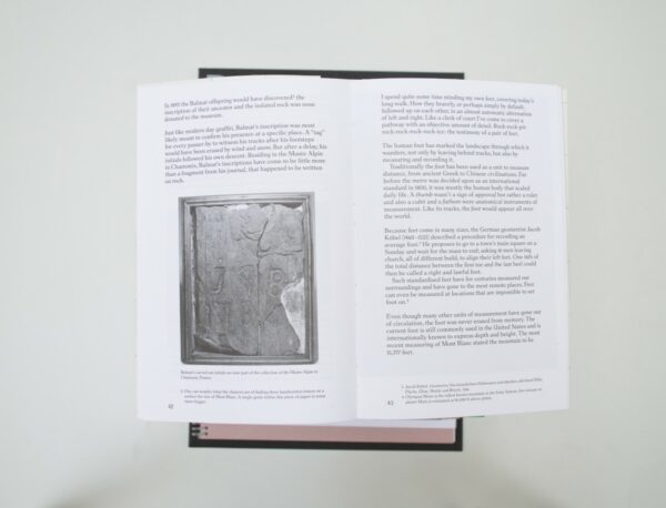
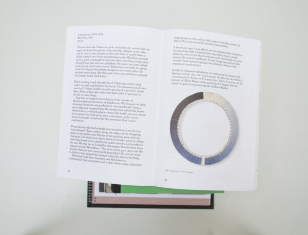
- Special features: two fold-outs showing images within the book, inspired by the antique travel journals from around the 18th century. The dust jacket can be taken off to show a big size print that uses elements of the modern walking maps such as the size of the paper, the raster that is used and the way it is folded. The dust jacket is made of stone paper which is in line with the geographical emphasize within the content of the book. An important element of the design is the table of content that is accompanied by an elevation chart showing the ascending and descending along the entire story of the book. In this way the complete narrative is depicted like a hilly panorama. The two colors making up the chart are representing both the movement of the body as the mind.
Birgit: Somehow this book didn’t make it to our top 30 immediately. As it is a small, delicate book, with a simple grid as a dust jacket, it got lost between all of the big, bulky books screaming for our attention. Luckily, at some point, Malin did find it and pointed it out to us. Then most of us did a complete 180 on the book. It’s about Vibeke Mascini’s journey to the top of Mont-Blanc and every detail has been carefully construed with meaning. From the stone paper used for the cover, to the walking map design. In the book itself, an analogy between walking and writing is used where the footnotes represent footprints. a mountain feels, with a clear view. I like the fact that even though the book is very well designed it never becomes too official; it still feels like someone’s personal travel diary.
Ruby: I remember my attention being brought to this book, and I was definitely one of the people that did a 180 on it, Birgit. The book is filled with smart yet delicate design choices. The stone paper jacket with a wide grid folds out into a map without references. The design and typography are done in a manner that leaves lot’s of space. Exactly how you would imagine walking to the top of a mountain feels, with a clear view. I like the fact that even though the book is very well designed it never becomes too official; it still feels like someone’s personal travel diary.
Auke: Stonepaper: one of the most satisfying things you will ever touch. I think this is a fun book. It’s not A4, but the they used the same margins as in a standard word document. The footnotes are small and placed at the bottom and the images stay within the text frame. Only in this case the maker has a sense for typography. That’s also why I do think – unlike Ruby – that it does feels quite official, almost scientific. And that’s not a bad thing. All of this makes me believe this story is more real, which I think is nice in this case.
Patrick: The choice for the stone paper is very good – both aesthetically and conceptually. The graphs feel a bit unrefined by the full surfaces. The subtleties in the choice of paper could, in my opinion, have been allowed to be implemented more in typography and graphs.
- Auteur
- Vibeke Mascini
- Oplage
- 250
- Omvang
- 94 + 2 fold-outs
- Prijs
- 40
- ISBN
- 978 90 824484 1 2
- Uitgever / Opdrachtgever
- Vibeke Mascini
- Ontwerper(s)
- Paul Gangloff, Amsterdam, Vibeke Mascini, Amsterdam/Brussel.
- Fotograaf
- Vibeke Mascini, Paul Gangloff
- Drukkerij
- Drukkerij Raddraaier, Amsterdam
- Boekbinderij
- Handboekbinderij Geertsen, Nijmegen
- Materiaal
- Paper for interior: 120gsm Munken Polar. Cover: 300gsm Munken Polar. Dust jacket: stone paper
- Lettertype
- Holland Nine by Laurenz Brunner and Monotype Grotesque
- Technische Bijzonderheden
- Special features: two fold-outs showing images within the book, inspired by the antique travel journals from around the 18th century. The dust jacket can be taken off to show a big size print that uses elements of the modern walking maps such as the size of the paper, the raster that is used and the way it is folded. The dust jacket is made of stone paper which is in line with the geographical emphasize within the content of the book. An important element of the design is the table of content that is accompanied by an elevation chart showing the ascending and descending along the entire story of the book. In this way the complete narrative is depicted like a hilly panorama. The two colors making up the chart are representing both the movement of the body as the mind.