FACING VALUE – RADICAL PERSPECTIVES FROM THE ARTS
FACING VALUE – RADICAL PERSPECTIVES FROM THE ARTS
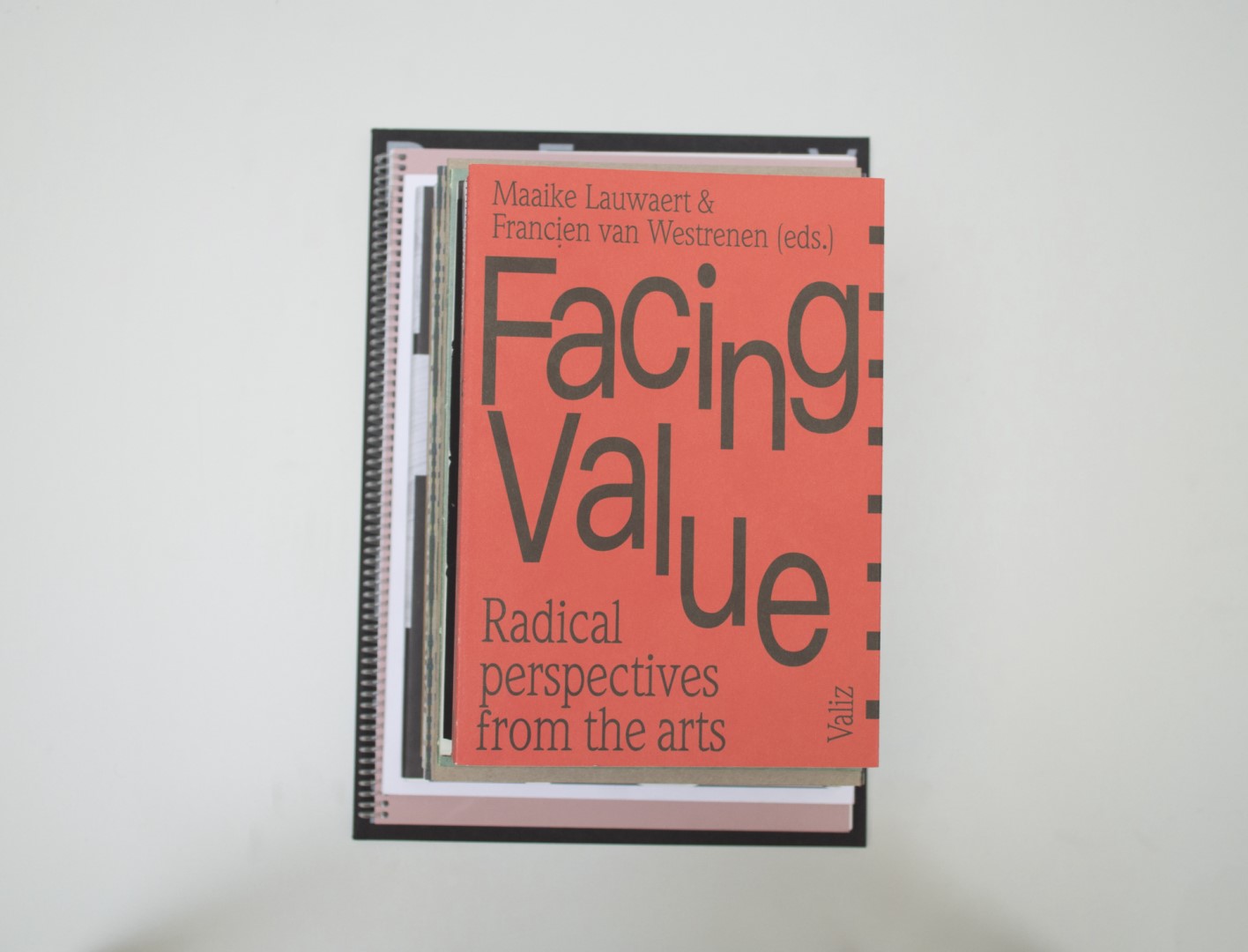
Ruby: This book feels lighter than it looks, and falls open very easily. But before opening it I was attracted by the letter placement of the title on the cover.
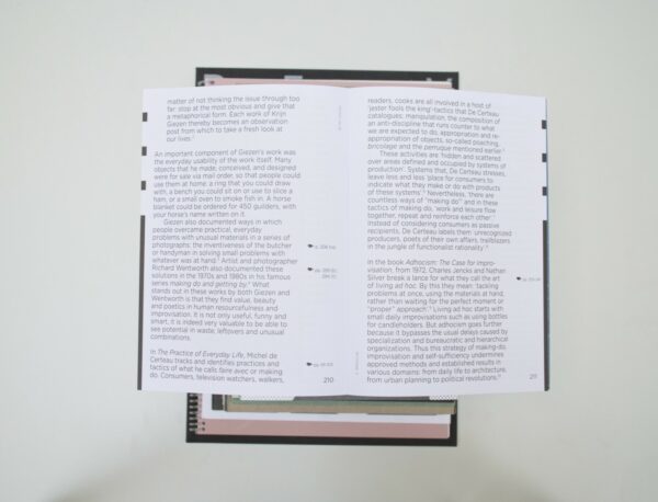
Patrick: For me, too much is happening and it becomes messy. Too many different fonts, font sizes and differences in spacing. Especially the chapter dividers do not work for me. The index that is made visible in the margins requires too much attention.
Birgit: I like the experiment in this book with regards to type and composition. The means it uses to navigate the book don’t really bother me as much as they do Patrick. I think the subject of the book is also quite important. Looking for other ways to appreciate value and the meaning of value in this society is crucial in contemporary society. I feel a progressive subject should have a progressive design to go with it, and this book knows how to do just that.
Auke: When I picked up the book it looked promising. Then I looked into the book and I was quite disappointed. For sure this is a matter of taste, but for me it’s too much and it adds up. Patrick is right about the index and chapter dividers. I think if they would’ve kept that less in-your-face it would’ve been better. It looks like they wanted to make the book stand out by putting in this ‘special feature’. For me it just doesn’t work. Maybe I missed the link and it becomes clearer when you read the book. Also, the paper has this blue-ish glow and too little contrast with the small serif typography. However, I like the other pages with the slightly bigger typography. To me it feel decisions still need to be made.
- Auteur
- Maaike Lauwaert, Francien van Westrenen (eds.)
- Oplage
- 2000
- Omvang
- 444
- Prijs
- 27,50
- ISBN
- 978 94 92095 00 8
- Uitgever / Opdrachtgever
- Valiz, Amsterdam
- Ontwerper(s)
- Elisabeth Klement, Laura Pappa, Amsterdam
- Drukkerij
- Bariet Ten Brink, Meppel
- Lithograaf
- (Mariska Bijl) Wilco Art Books, Amersfoort
- Boekbinderij
- Wilco BV | Boeken & Tijdschriften, Amersfoort
- Materiaal
- Paper for interior: 90gsm Soporset Offset (Antalis), 100gsm Cyclus Offset nature white (Igepa). Cover: 200gsm Cyclus Offset Natuurwit (Papyrus)
- Bindwijze
- cold-glued binding
- Lettertype
- Gotham Rounded, Weidemann Book, Pingfang HK


