
DE GESTIEK VAN DE ARCHITECTUUR
DE GESTIEK VAN DE ARCHITECTUUR
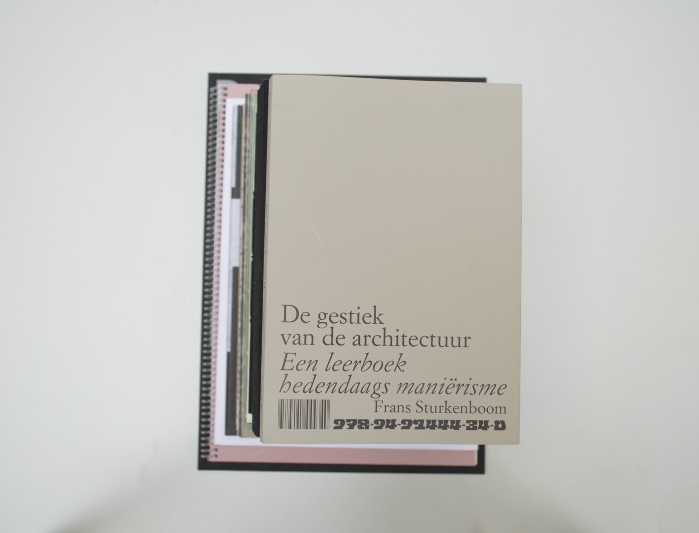
Ruby: I’ll admit that when going through the 400+ books the first time around this book didn’t impress me much. I didn’t recall seeing it when it ended up being judged in the second round. Boy, was I happy the other judges did spot its quality. It might not have been love at first sight, but it definitely was love at second or third sight. The cover is quite simple and understated, and the design on the inside continues in this manner. It is not a book that demands attention because of bold design choices, its excellence lives in the typographic details. I really enjoy how it resembles a very standard type of textbook, but when you take a closer look it’s actually quite special. The weight of it feels great in my hands, and the book opens beautifully, and most importantly it makes me want to read it.
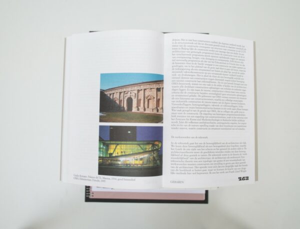
Malin: I agree. What I also found quite special about this one was the arrangement of the pictures.;they are aligned to the button of the page, as if placing the foundation of a building. You can feel the weight of the architecture. Ruby, that you mentioned the weight of the book itself makes me think about how well it is thought through.
Patrick: I totally agree! It was nice to see a textbook, between all the entries, with good typography that does its job, but with very nice design choices that create some friction (the placement of the images and the pagination) and make it a special book. The binding choice ensures that the book opens nicely, which is important with the images that go all the way to the fold.
Birgit: I liked how this book is a bit different from the rest. As Patrick said, it is a textbook and we don’t have too many of those. That this book did stand out to us in the parade of extravagant books that we’ve seen says something about the quality of the book. You could say it’s quite a classic book, but within these frames it does something different with the image placement and the pagination. Nicely done!
Auke: A good design is a design you don’t see. Just stick to a few rules. Beautiful in its simplicity, like the stone/Barok-ish page numbers that start on the cover and continue through the whole book, always on the same line,and which happen to fit the ornamental imagery in the book. Where can I buy it?
- Auteur
- Frans Sturkenboom
- Serie
- ArtEZ Academia
- Oplage
- 1500
- Omvang
- 269
- Prijs
- 34,50
- ISBN
- 978 94 91444 34 0
- Uitgever / Opdrachtgever
- ArtEZ Press, Arnhem.
- Ontwerper(s)
- Josse Pyl, Amsterdam
- Drukkerij
- Platform P, Rotterdam
- Lithograaf
- Colour & Books, Apeldoorn (Sebastiaan Hanekroot)
- Boekbinderij
- Platform P, Rotterdam
- Materiaal
- Paper for interior: 90gsm Munken Print White 1.50 (Antalis). Cover: 170gsm Munken Lynx (Antalis). Dust jacket: 270gsm Curious Matter Andina Grey (Antalis).
- Bindwijze
- sewn Otastar
- Lettertype
- Simoncini Garamond (Linotype)
Ruby: I’ll admit that when going through the 400+ books the first time around this book didn’t impress me much. I didn’t recall seeing it when it ended up being judged in the second round. Boy, was I happy the other judges did spot its quality. It might not have been love at first sight, but it definitely was love at second or third sight. The cover is quite simple and understated, and the design on the inside continues in this manner. It is not a book that demands attention because of bold design choices, its excellence lives in the typographic details. I really enjoy how it resembles a very standard type of textbook, but when you take a closer look it’s actually quite special. The weight of it feels great in my hands, and the book opens beautifully, and most importantly it makes me want to read it.
Malin: I agree. What I also found quite special about this one was the arrangement of the pictures.;they are aligned to the button of the page, as if placing the foundation of a building. You can feel the weight of the architecture. Ruby, that you mentioned the weight of the book itself makes me think about how well it is thought through.
Patrick: I totally agree! It was nice to see a textbook, between all the entries, with good typography that does its job, but with very nice design choices that create some friction (the placement of the images and the pagination) and make it a special book. The binding choice ensures that the book opens nicely, which is important with the images that go all the way to the fold.
Birgit: I liked how this book is a bit different from the rest. As Patrick said, it is a textbook and we don’t have too many of those. That this book did stand out to us in the parade of extravagant books that we’ve seen says something about the quality of the book. You could say it’s quite a classic book, but within these frames it does something different with the image placement and the pagination. Nicely done!
Auke: A good design is a design you don’t see. Just stick to a few rules. Beautiful in its simplicity, like the stone/Barok-ish page numbers that start on the cover and continue through the whole book, always on the same line,and which happen to fit the ornamental imagery in the book. Where can I buy it?
- Auteur
- Frans Sturkenboom
- Serie
- ArtEZ Academia
- Oplage
- 1500
- Omvang
- 269
- Prijs
- 34,50
- ISBN
- 978 94 91444 34 0
- Uitgever / Opdrachtgever
- ArtEZ Press, Arnhem.
- Ontwerper(s)
- Josse Pyl, Amsterdam
- Drukkerij
- Platform P, Rotterdam
- Lithograaf
- Colour & Books, Apeldoorn (Sebastiaan Hanekroot)
- Boekbinderij
- Platform P, Rotterdam
- Materiaal
- Paper for interior: 90gsm Munken Print White 1.50 (Antalis). Cover: 170gsm Munken Lynx (Antalis). Dust jacket: 270gsm Curious Matter Andina Grey (Antalis).
- Bindwijze
- sewn Otastar
- Lettertype
- Simoncini Garamond (Linotype)