A BED, A CHAIR AND A TABLE STORIES FROM THE POORTGEBOUW
A BED, A CHAIR AND A TABLE STORIES FROM THE POORTGEBOUW
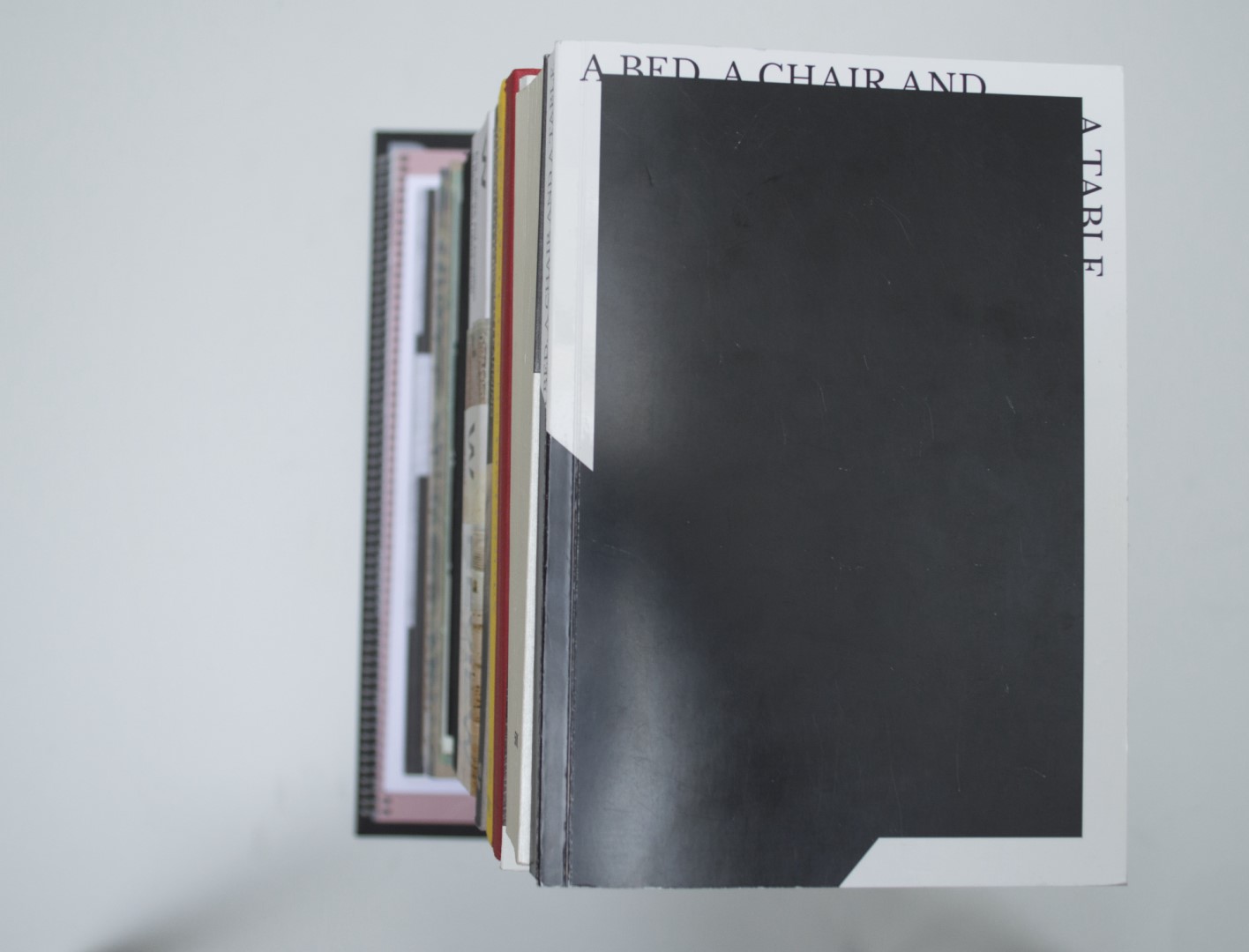
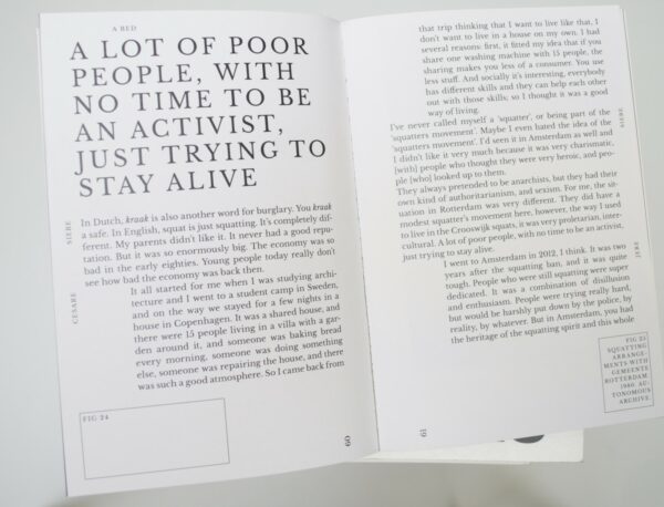
Patrick: We almost missed this book. Only at the very last moment did one of the jury members pick it out. “And this book?”, he asked. “Have we looked at this properly?” At first it does not look very attractive at all, but when you look at it more closely, it is full of clever and beautiful solutions in typography. Especially the way in which the image references are placed on the pages. The somewhat extreme indents that are used to differentiate between paragraphs make it clear to me that this book has to be part of this years selection. Here and there, the book is a bit messy, and normally I’d get annoyed by that, but with this content the design should not have been any different.
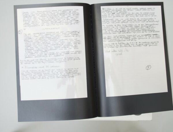
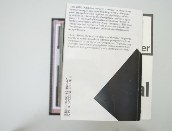
Ruby: I think one of the reasons we missed this book was because it has a rather underwhelming cover. It is only when you open the book that the excellent typography is revealed. I love the font and the way the letters are placed, I also really enjoy, as Patrick mentions, that they use outlines with the dimensions of the images on the page before. The paper they use is glossy on one side and matte on the other. The glossy side always has images on it and the matte part has text. It creates a nice dynamic experience that suits the content very well.
Auke: I agree. The typography is typeset very niftily. The proportions are nice and trigger me to explore the book further. Who said a digital copy can’t be nice? Ruby, you mentioned the finishing of the two different sides of paper. I like how this contrasting aspect evolves with the way the ink appears on the glossy paper. It’s so simple but gives it an overall coherent appearance.
Birgit: I don’t really mind the cover that much, although I do agree it didn’t immediately stand out. Mostly, I like the book. Again, the use of glossiness and matte on the pages works well and a lot of the design decision are well-founded.
- Auteur
- Experimental Publishing Curse of the Piet Zwart Institute Media Design Master (XPUB)
- Oplage
- 200
- Omvang
- 194
- ISBN
- 978 90 821182 4 7
- Uitgever / Opdrachtgever
- XPUB, Rotterdam & Meta/Books, Amsterdam
- Ontwerper(s)
- XPUB, Rotterdam. Drukkerij Raddraaier, Amsterdam.
- Boekbinderij
- Boekbinderij Hennink, Amsterdam
- Materiaal
- Paper for interior: 135gsm Chromolux (Antalis). Cover: 300gsm Chromolux 700 (Antalis)
- Lettertype
- Libre Baskerville, Impallari Type
- Technische Bijzonderheden
- paperback printed in black and white with poster-zine printed in one neon colour.


