POOL 1
POOL 1
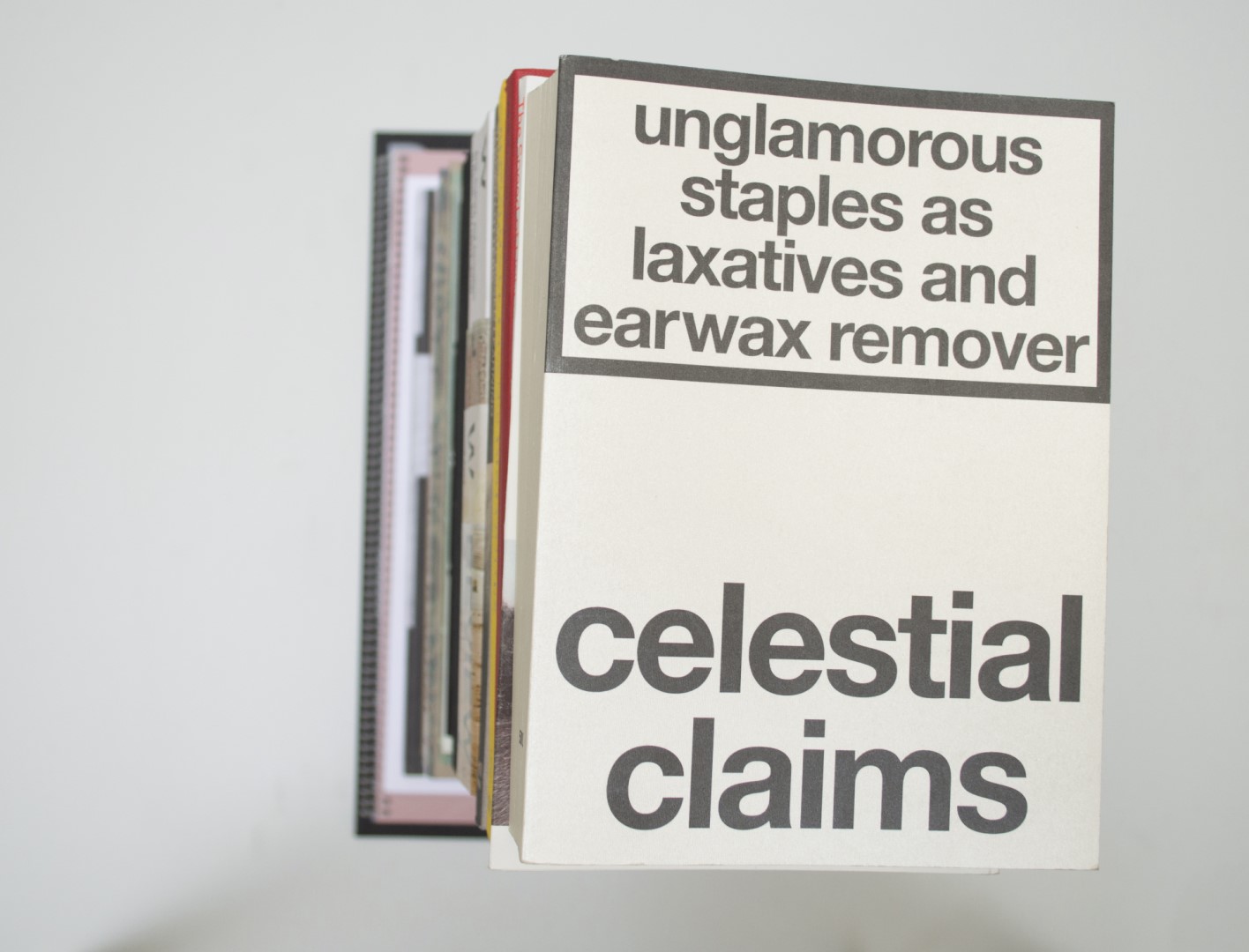
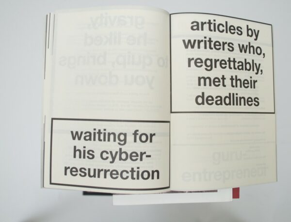
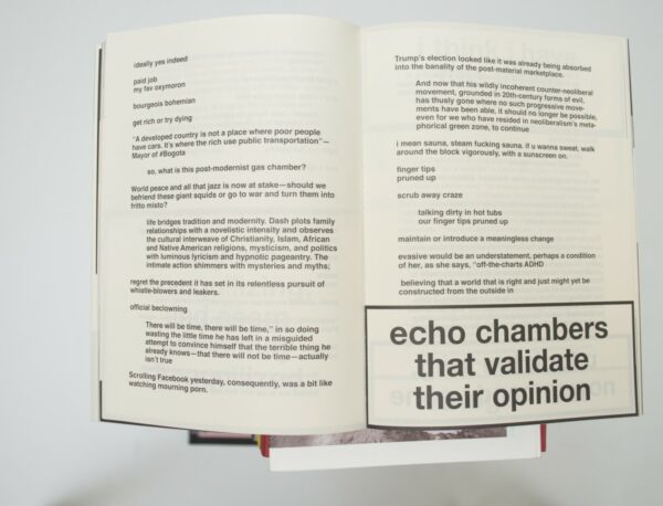
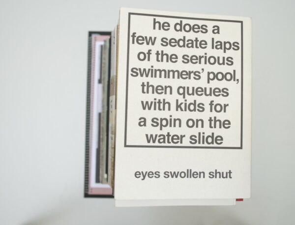
Ruby: Thisss isss sooo not swisss, reads one of the exclamations in Nora Turato’s book Pool 1. Somehow this book really stood out. An organised mess shaped like a large pack of shiny Marlboro Lights. No images, just text. Sometimes shaped like the warning signs on cigarettes, sometimes just outbursts of sentences underneath each other. A very nice object that you can just browse through and read like a song or a rap. The design feels much like the performances Nora Turato does, and that is why I think it works so well.
Malin: And Malboro is probably the brand she smokes. Brilliant! 😉
Birgit: I don’t really know how to feel about this book. It’s a bit much for me, but then again that’s also where its strengths lie. I think this is more a matter of personal taste so I will refrain from saying too much.
Auke: Whether you like Helvetica or not, whether you smoke or not, these cigarette pack warnings draw your attention. So does this big pearl shiny ‘Marlboro Lights’ box, as Ruby calls it. I’m impressed by the way the innerwork of this book has been printed. In the book, you see that outlines are placed exactly on the bleed. Since there is always a chance of three millimeters of shift on the cut,while printing, it can happen that the outlines are not equal on every side. You barely see this in this book. In terms of letter size and line space there is not much consistency inside the ‘warning boxes’ throughout the book, but I don’t mind. I like the big contrast. It gives a nice flow while you’re browsing through the book.
- Auteur
- Nora Turato
- Oplage
- 500
- Omvang
- 704
- Prijs
- 40
- Uitgever / Opdrachtgever
- Nora Turato
- Ontwerper(s)
- Sabo Day, Amsterdam
- Drukkerij
- robstolk®, Amsterdam
- Boekbinderij
- Stronkhorst Boekbinders, Groningen
- Materiaal
- Paper for interior: 85gsm Arcoprint Edizioni 1.3 Avorio (Fedrigoni). Cover: 85gsm Gmund Colors Metallic 07.
- Lettertype
- Helvetica Medium


