LIGHT AS A METAPHOR FOR TRUTH: AT THE PRELIMINARY STAGE OF PHILOSOPHICAL CONCEPT FORMATION
LIGHT AS A METAPHOR FOR TRUTH: AT THE PRELIMINARY STAGE OF PHILOSOPHICAL CONCEPT FORMATION
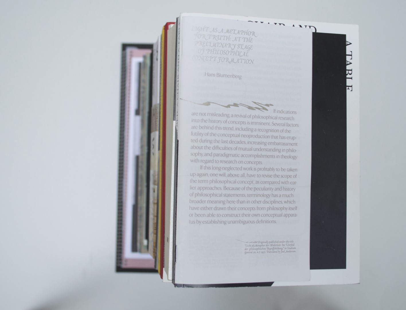
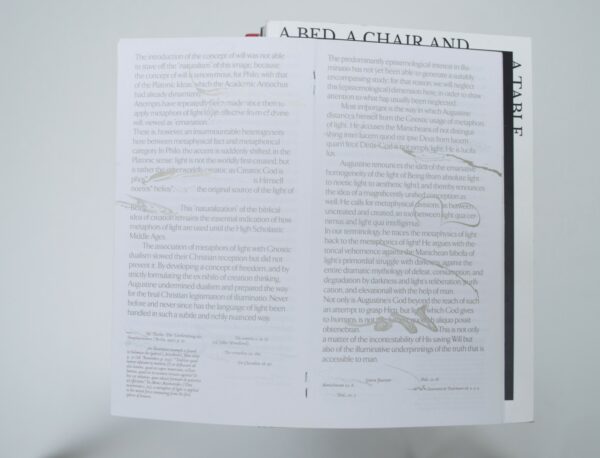
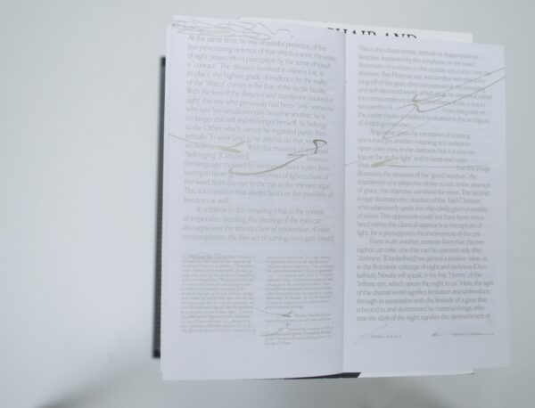
Malin: Well, one could say this is not really a book; one might consider it a booklet. Anyhow, It is truly refreshing to hold this piece of printed matter in hand. Finally a graphic designer indulged in footnotes. A dry numbering system has been replaced by spontaneous hand-drawn lines and, on top of it all, the entire text is printed in gold. It’s definitely fun to look at; I can’t wait to actually read it.
Ruby: I think it’s nice and important to include some student publications in our selection. I remember that, in our discussions, the judges were somewhat divided about what a ‘best verzorgde’ book entails. The reason why I rooted for this book was that I think it’s not only really well done, it’s also a perfect example of a work made on a small budget without a whole team of professionals working on it.
Birgit: To be honest, I didn’t really get this tiny leaflet. Is this piece of paper still considered a book? Whereas The Speed of Light did give me enough to work with and expanded the boundaries of what a book could be, Light as a Metaphor for the Truth didn’t really give me this feeling. Although I do believe it is well-made and an intriguing read, I just don’t feel it really belongs as a BVB. But maybe this just points out a lack of rewards for paper expressions. Maybe there should also be a Best Verzorgde Papieruiting?
Patrick: I’m sorry, this book is not my thing. It’s nice to see that there is a designer who tries to do something different with the footnotes, but for me, that is the only thing that makes it a special book. I do not find the typography exciting or surprising and there is sloppiness like orphans in it. Fortunately, the other jurors were extremely enthusiastic and the book is still in the selection.
Auke: Our swissman can’t stand the orphans. I agree that orphans in such a small publication (folder) with not so much text should not appear at all. Otherwise, I really like how the sand-gold ink changes and reflects light when you move it around. A cool combination of typefaces set in nice proportions. An exciting, fun, cheaply produced publication.
- Auteur
- Hans Blumenberg
- Oplage
- 50
- Omvang
- 46
- Prijs
- 10
- Uitgever / Opdrachtgever
- Steven Lenoir
- Ontwerper(s)
- Steven Lenoir
- Drukkerij
- Joos Wiersinga, Amsterdam
- Boekbinderij
- Gerrit Rietveld Academie, Amsterdam
- Materiaal
- Paper for interior: LuxoArt (Papyrus).
- Lettertype
- TF Arrow Light, Adobe Jenson Swash and Sparkle Italic by Steven Lenoir
- Technische Bijzonderheden
- Printed with specifically mixed metallic and solid inks. Originally published under the title “Licht als Metapher der Wahrheit: Im Vorfeld der philosophischen Begriffsbildung”.


