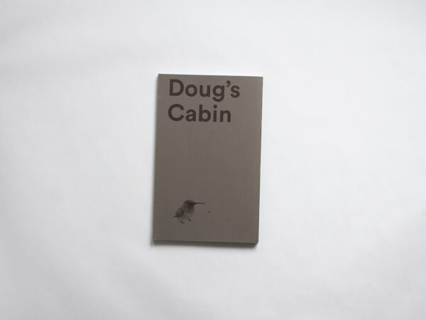
Doug’s Cabin
Doug’s Cabin
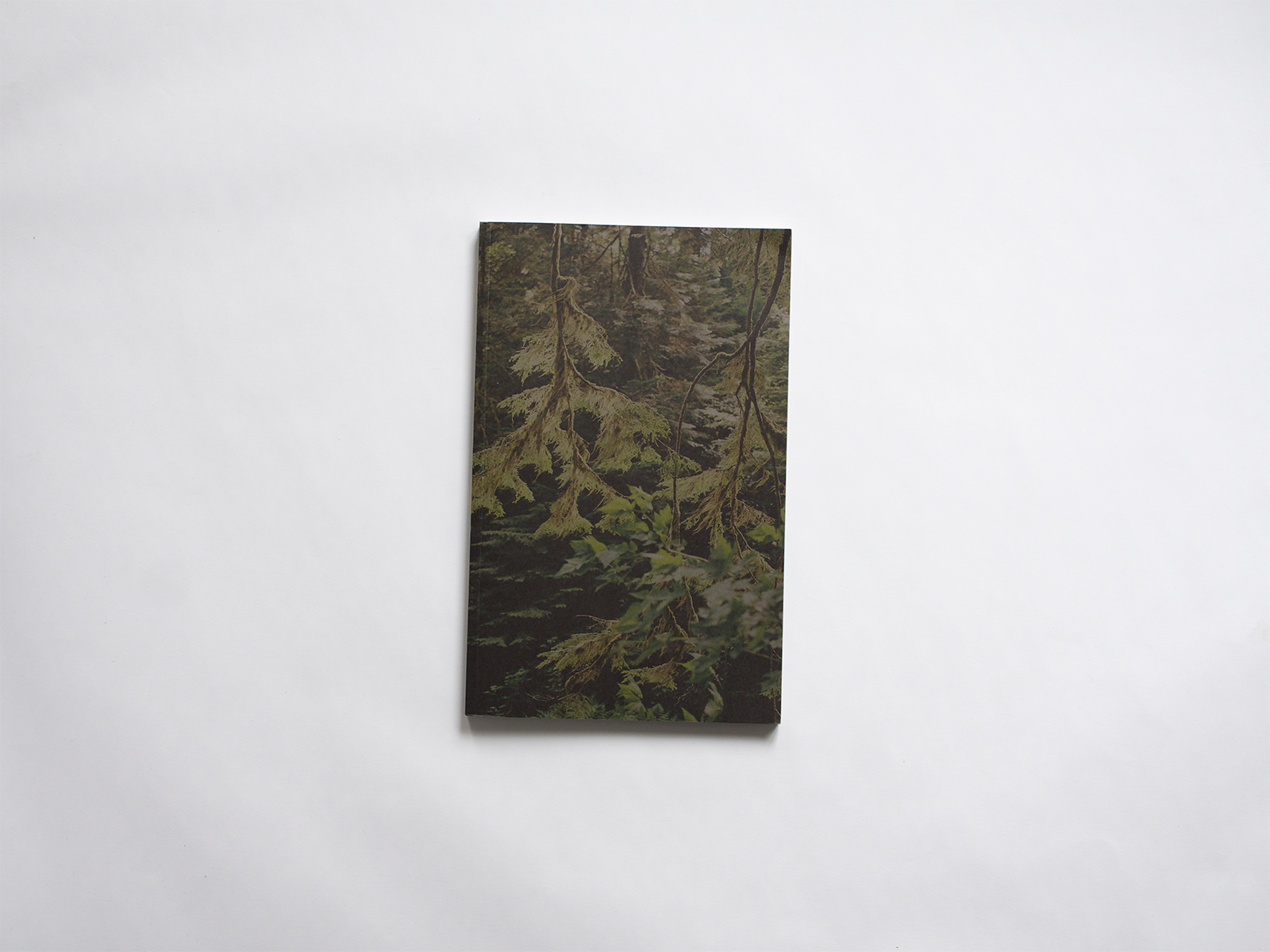
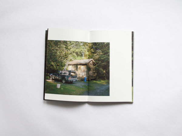
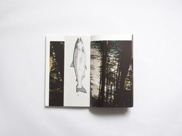
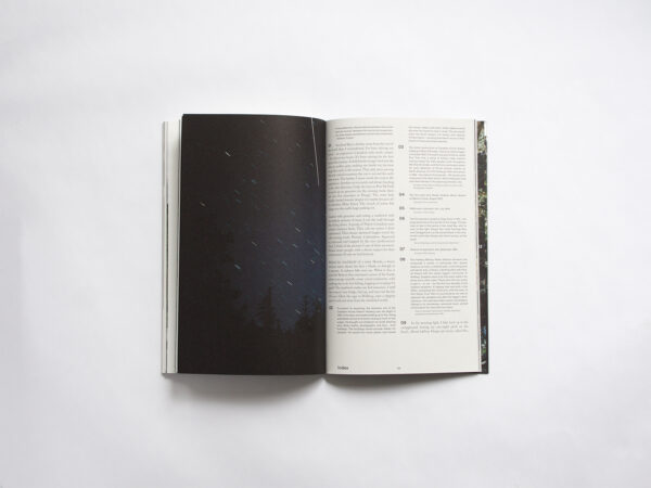
We discussed this book quite a lot. Obviously we liked it enough to put it in the collection, but I think we also all went through a stage of some doubt. It is a meticulously printed book. The deepness of the ink used for the photographs is intense, especially when paired with the visual narrative that pulls you in. You can feel an unusual story unfold throughout the book. However, we were initially confused by a few design choices. Some of us felt that the image placement was strange, often seeming like there was no reason for the image to be where it was or why there was so much white space. But as it started to grow on us, the empty spaces around a few of the images on some of the spreads created more impact on the pages with full spread images. It draws you in and makes you study the image in front of you. We started off a little uncertain, but in the end we agreed that the inner content is well put together. The mash-up of newsprint and photo book visuals creates a strong and curious narrative. The cover works almost as good but we felt that the typography was off. Why so large? It feels too clumsy in comparison with everything else. But to end on a good note, the bird is cute though.
- Auteur
- Karianne Bueno
- Serie
- No
- Oplage
- 700
- Omvang
- 192
- Prijs
- € 40
- ISBN
- 978-94-92051-43-1
- Verschijningsdatum
- 8 March 2019
- Uitgever / Opdrachtgever
- The Eriskay Connection (Breda)
- Ontwerper(s)
- PutGootink (Amsterdam)
- Fotograaf
- Karianne Bueno
- Drukkerij
- Printing Matters (Amsterdam)
- Lithograaf
- Marc Gijzen (Voorburg)
- Boekbinderij
- Stronkhorst (Groningen)
- Materiaal
- Paper interior: Pergraphica Classic Rough, 120 grams
Paper end papers: Druckfix 2000, 60 grams
Cover material: Environment Wrought Iron, 270 grams
- Bindwijze
- Softcover
- Lettertype
- Circular (Lineto), Caslon (Adobe)
- Technische Bijzonderheden
- Gedrukt in 5 kleuren (cmyk + extra zwart).
