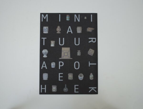
DE VERZAMELAARSKAST MET MINIATUURAPOTHEEK
DE VERZAMELAARSKAST MET MINIATUURAPOTHEEK
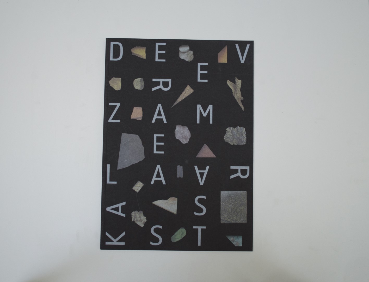
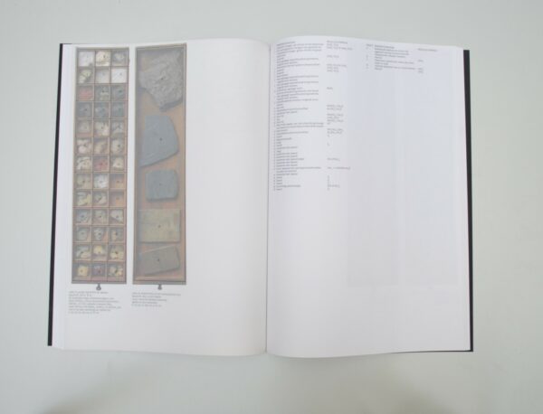
Malin: Oh, how much we discussed this publication. First of all, I think we all quite liked it, but none of us really loved it. Correct me if I’m wrong. What I generally liked is that it is a publication about collections that again became a container – a collection again. So, to say, a collection of a collection. We found the transparent paper quite refreshing, but when we looked through all of the publications, we realized that there were several books with transparent paper. It’s so 2017! When it came to discussing our final selection, this book happened to lie next to an artist publication was also designed by Irma Boom. We recognized similarities in the size and width of the books and in the overall design. Was it just a coincidence? We did not understand why the title had to be arranged in huge letters on a grid throughout the entire format. It also reminded us of the cooking book she made last year. It’s not easy to invent the wheel again. But in this case we were slightly disappointed and kicked the other book out of the selection.
Ruby: The publication was about artist Claudy Boomstra! Indeed, it was funny to see all the Irma Boom entries next to each other. It became clear that she incorporated some of the same ideas in many publications, which led to us having to compare them and really think about where these ideas worked best.
Birgit: We definitely discussed the Irma Boom books a lot. As she has quite a distinctive style, some of us felt the books became too similar. I don’t really mind this as much as some do. Why change a winning team?
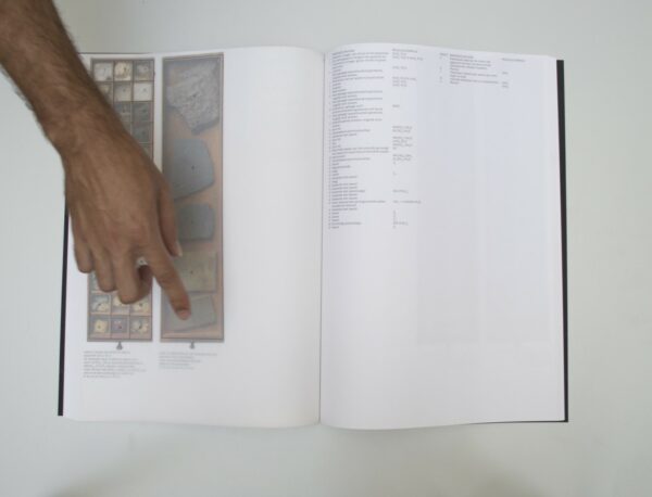
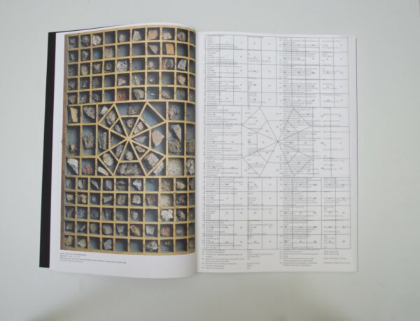
Auke: If we’re talking sports terms now, I prefer creative play over safe play, but let’s stick to the issue. The book is an art-object itself and I want it! The big-size format, the soft matt-black cover with the shiny objects printed on top. I never really liked antique cabinets but this book proved me wrong. What a site-specific book in a positive sense. It’s very nicely dissected and archived. Thereafter, it’s designed in a clean and explanatory way with a lot of white space giving attention to the details. The semi-transparent pages connecting the images with the text work really well. Nice!
Patrick: If a book can make sure that I do not find the tracingpaper terrible, then it actually belongs to this selection. Almost everything has already been said. That this book has become a new collection of collections is very strong and the way this has been done works very well. The large size ensures that it really becomes an object and immediately catches the ey
- Auteur
- Paul van Duin (ed.)
- Oplage
- 1750
- Omvang
- 184
- Prijs
- 40
- ISBN
- 978 94 9171 461 0
- Uitgever / Opdrachtgever
- Rijksmuseum, Amsterdam
- Ontwerper(s)
- Irma Boom Office, Amsterdam (Irma Boom, Tariq Heijboer
- Drukkerij
- Lenoirschuring, Amsterda
- Lithograaf
- Lenoirschuring, Amsterdam.
- Boekbinderij
- Boekbinderij Patist, Den Dolder.
- Materiaal
- Paper for interior: 120gsm Arcoprint Milk, 90gsm Kalk Glama (Fedrigoni/ Igepa). Cover: 300gsm Arcoprint Milk (Fedrigoni)
- Lettertype
- Rijksmuseum
- Technische Bijzonderheden
- Special features: printed full colour using silver ink on black paper.
