THE LAZY ARTIST AND OTHER STORIES
THE LAZY ARTIST AND OTHER STORIES
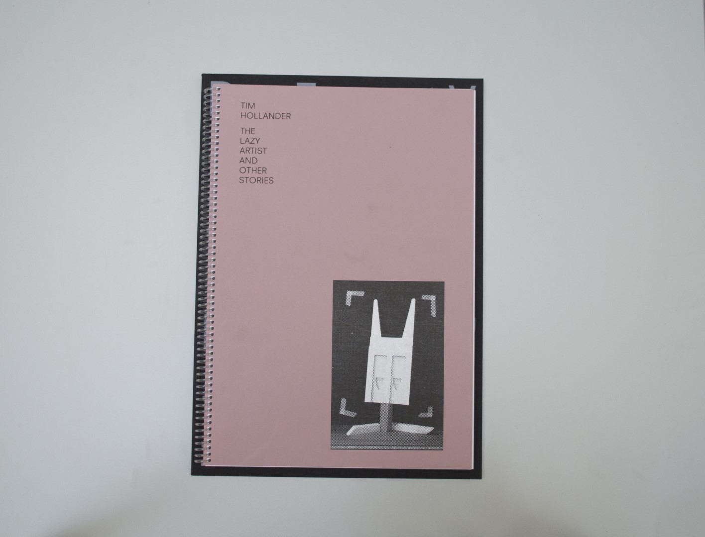
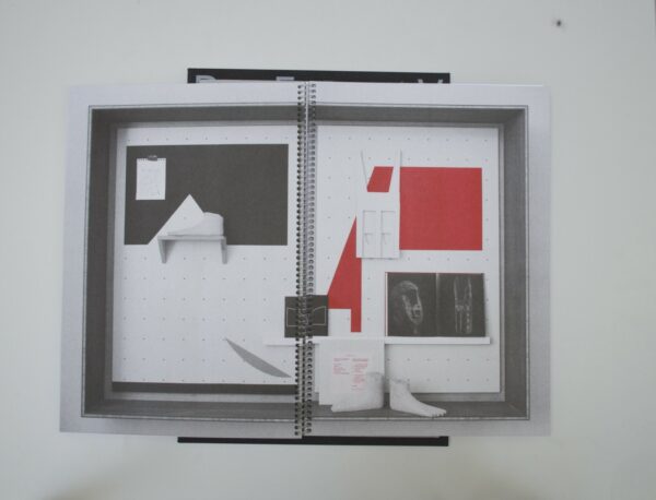
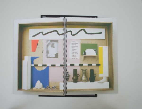
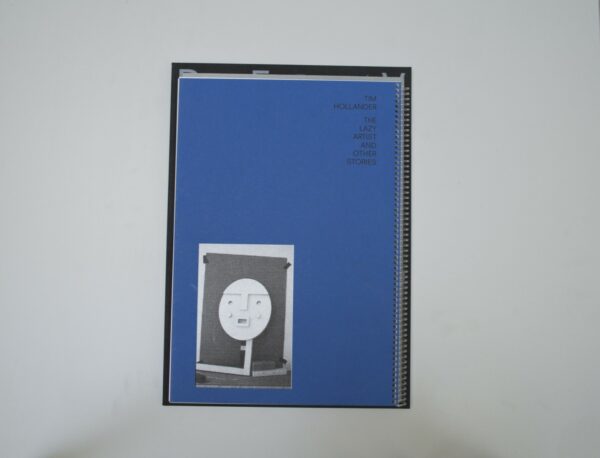
Birgit: This book could just as well have been someone’s spiral notebook. But this minimalist book design gives room to beautiful RISO-printed pages that feature work by Tim Hollander. The artist used a physical display as a design tool to create content in which 3D and 2D work together to create beautiful compositions.
Malin: At first I thought it is the second edition of Original Risography by Studio Operative – a manual with which you learn how to print in four colors with a risograph. Maybe it is because Tim Hollander really figured out how to use a risograph properly. Maybe also, because both publications have spirals. At first I was hesitant about these similarities, but then I thought: it is actually great if the designer learned from the manual. And if you don’t know it yet, Tim, I really think you would like it!
Ruby: The cover and binding of this book reminds me of a family photo album. It reminds me a bit of a crafty do-it-at-home project, which was perhaps what was being aimed for since the compositions shown on spreads on the inside of the book also have this crafty quality. Nice risograph prints. I’m not the biggest fan of the book, although I couldn’t tell you why exactly. Perhaps because I just have little to say about it.
Patrick: Good choices in production. The spiral binding allows the book to open completely and, together with the thick paper, makes it really feel like a big display. As mentioned before, tight risograph prints.
Auke: I share Patrick’s opinion. I think it’s a very nice object for on the table. Also, sometimes it is not necessary that you have to be able to say a lot about something. It is what it is. There is not much to explain.
- Auteur
- Tim Hollander
- Oplage
- 75
- Omvang
- 72
- Prijs
- 175
- Uitgever / Opdrachtgever
- Tim Hollander
- Fotograaf
- Charles Nypels Lab, Jan van Eyck Academie, Maastricht.
- Boekbinderij
- Spronk Grafische Afwerking, Maarheeze.
- Materiaal
- Paper for interior: Munken Lynx Rough (Antalis). Cover: Crescent passe-partout card.
- Lettertype
- Neuzeit S LT Std
- Technische Bijzonderheden
- Screenprinted using the Risograph process. Compositions and images were made in the studio within a physical frame of 200 by 140 centimeters. Sketches, sculptures, prints, books, work by other artists and remains of earlier work were treated equally in compositions with ever-changing and unclear hierarchies. Every graphic element in the images like a page number, a black line and the colophon had to be translated physically and placed in the physical frame.