TOBIAS TEBBE – SELFQUEST
TOBIAS TEBBE – SELFQUEST
Tobias Tebbe Selfquest
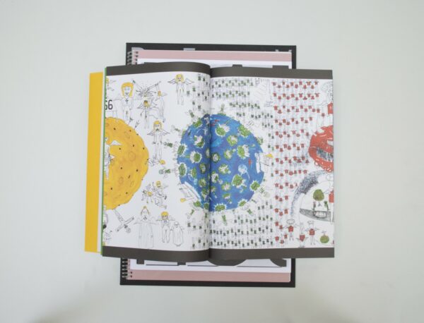
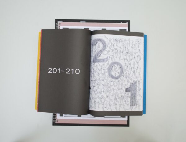
Patrick: This book is beautiful because of its simplicity. The book only shows the illustrations of Tobias Tebbe and nothing else. You can feel the width of the illustrations very well through the choice of running the illustrations across multiple pages. The choice of Japanese folding reinforces this in exactly the right way. A nice detail this yields is the structure created along the cutting edges of the book. The idea of the wide illustrations is also subtly brought back in typography. By choosing a letter that is broader than normal you feel the same width on the text pages. The fold-out pages at the beginning of each chapter were a bit unnecessary.
Ruby: This book is funded by Stichting Siza, Arnhem, who stimulate the artistic development of disabled artists. This book shows us the work of outsider artist Tobias Tebbe, whose extensive and detailed drawings are incredibly impressive. In a way I appreciate the simplistic way this book has been put together. It lets the content speak for itself. I, however, could have benefited from a bit more information. In the fold-out pages that Patrick mentioned earlier there is a dimension given, but I don’t understand to what exactly this dimension refers to. Maybe if it was a little bit less simplistic it would have been clearer.
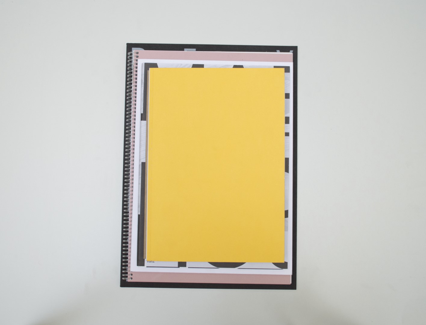
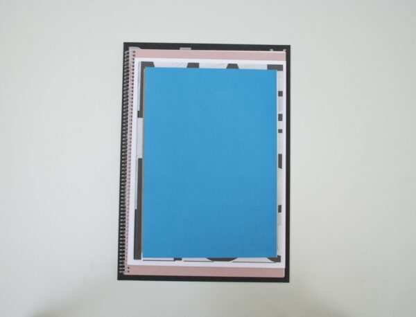
Birgit: There’s not much more to add, but I liked the reference to the four primary colors on the cover and within the book. They link ingeniously to the drawings made by Tobias.
Auke: When the book is closed it looks like you’re holding a map. What Birgit said about the colors also enforces this feeling to me. Then you open the book and it appears to be some sort of landscape map. Every time you open the book you’ll discover something new and the journey is different. A really fun collaboration. Chapeau!
- Auteur
- Tobias Tebbe
- Oplage
- 350
- Omvang
- 240
- Prijs
- 50
- ISBN
- 978 90 826935 1 5
- Uitgever / Opdrachtgever
- Jean-Claude & Pierrot, Amsterdam.
- Ontwerper(s)
- Nathanaël Reuling Ontwerp, Amsterdam, René Munneke, Arnhem.
- Drukkerij
- NPN Drukkers, Breda
- Lithograaf
- KOLORworkx, Amsterdam (Marco Kokkelkoren)
- Boekbinderij
- Boekbinderij Patist, Den Dolder
- Materiaal
- Cover: 300gsm Arcoprint Milk (Fedrigoni). Paper for interior: 85gsm Arcoprint Milk (Fedrigoni).
- Lettertype
- Univers Extended, Linotype
Tobias Tebbe Selfquest
Patrick: This book is beautiful because of its simplicity. The book only shows the illustrations of Tobias Tebbe and nothing else. You can feel the width of the illustrations very well through the choice of running the illustrations across multiple pages. The choice of Japanese folding reinforces this in exactly the right way. A nice detail this yields is the structure created along the cutting edges of the book. The idea of the wide illustrations is also subtly brought back in typography. By choosing a letter that is broader than normal you feel the same width on the text pages. The fold-out pages at the beginning of each chapter were a bit unnecessary.
Ruby: This book is funded by Stichting Siza, Arnhem, who stimulate the artistic development of disabled artists. This book shows us the work of outsider artist Tobias Tebbe, whose extensive and detailed drawings are incredibly impressive. In a way I appreciate the simplistic way this book has been put together. It lets the content speak for itself. I, however, could have benefited from a bit more information. In the fold-out pages that Patrick mentioned earlier there is a dimension given, but I don’t understand to what exactly this dimension refers to. Maybe if it was a little bit less simplistic it would have been clearer.
Birgit: There’s not much more to add, but I liked the reference to the four primary colors on the cover and within the book. They link ingeniously to the drawings made by Tobias.
Auke: When the book is closed it looks like you’re holding a map. What Birgit said about the colors also enforces this feeling to me. Then you open the book and it appears to be some sort of landscape map. Every time you open the book you’ll discover something new and the journey is different. A really fun collaboration. Chapeau!
- Auteur
- Tobias Tebbe
- Oplage
- 350
- Omvang
- 240
- Prijs
- 50
- ISBN
- 978 90 826935 1 5
- Uitgever / Opdrachtgever
- Jean-Claude & Pierrot, Amsterdam.
- Ontwerper(s)
- Nathanaël Reuling Ontwerp, Amsterdam, René Munneke, Arnhem.
- Drukkerij
- NPN Drukkers, Breda
- Lithograaf
- KOLORworkx, Amsterdam (Marco Kokkelkoren)
- Boekbinderij
- Boekbinderij Patist, Den Dolder
- Materiaal
- Cover: 300gsm Arcoprint Milk (Fedrigoni). Paper for interior: 85gsm Arcoprint Milk (Fedrigoni).
- Lettertype
- Univers Extended, Linotype