WAR SAND
WAR SAND
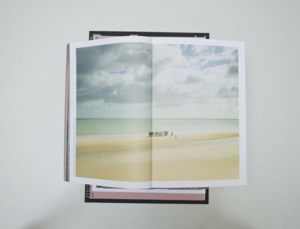
Malin: No other publication has taken me so long to deal with as War Sand. This book must be incredibly genius or simply clumsy. I guess we picked it because we believe it is genius. It’s a massive book, full of photographs and illustrations, and a very short chapter describing the story in words. This is what I grasped: a story of British soldiers stealing sand samples from a beach in France during World War II. In the first chapter, I find nice but unexciting photographs of the beach. I like how it starts, but what are the “crossword puzzles” hidden in the fold of this chapter? I continue flipping through the book and find micro shots of sand. Somehow, the design in this chapter speaks a total different language. I move on, and again the visual language is changing. Suddenly I find photographs of tin soldiers and a chapter of a sequence from a movie, obviously related to this event. Maybe the design is not the most convincing but there is something about it that kept my attention for quite some time!
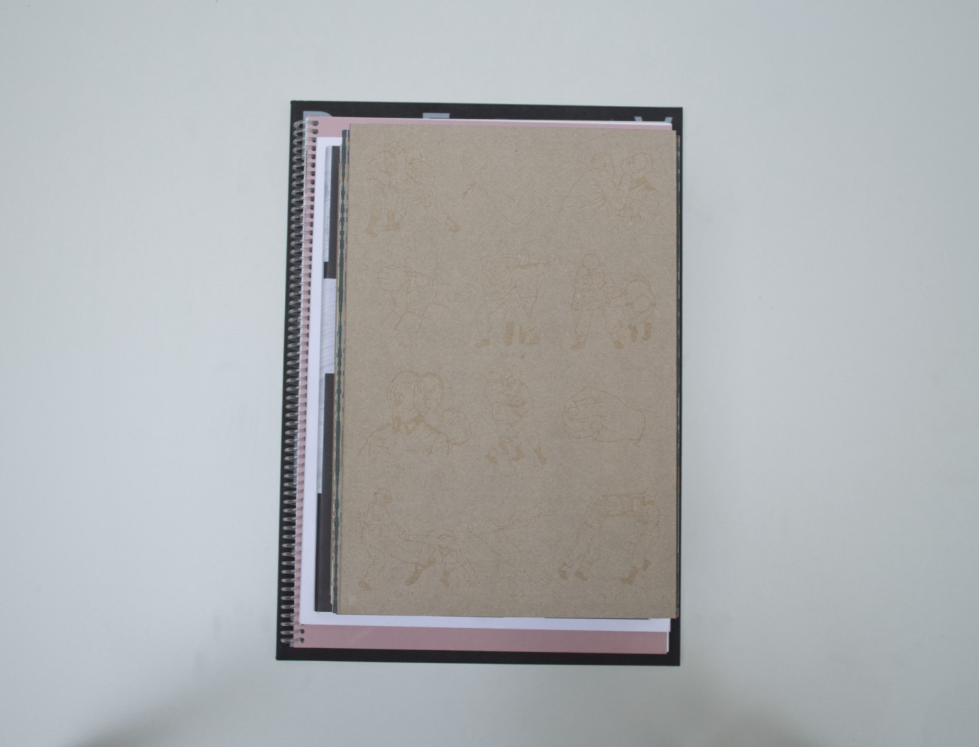
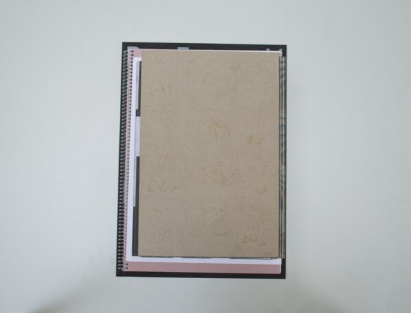
Ruby: I really like the cover of this book. The textless cardboard-coloured cover is embossed with multiple cartoon-like figures. It’s a subtle way of introducing the subject matter of the book. As Malin said already, I also get the sense that the book speaks multiple visual languages. It has many layers to it, and in a way I perceive each signature as a new part; when the paper changes, the story changes. It feels like the result of research – around the same theme – that went to many different places; a journal of many different findings. I’m intrigued.
Patrick: I, too, had the doubt that Malin has there. Though I lean a bit more towards clumsy. It looks messy and somewhat childish because of the many different colors, paper types and typographic choices. Still, despite that, I keep browsing through it. You feel that a story is being told with many different layers of information.
Birgit: To me, the book also felt a bit clumsy at times. There was a lot to see in the book, and like the others, it mostly intrigued me. But some of the design choices in the book didn’t really make sense to me. It was a lot to take in.
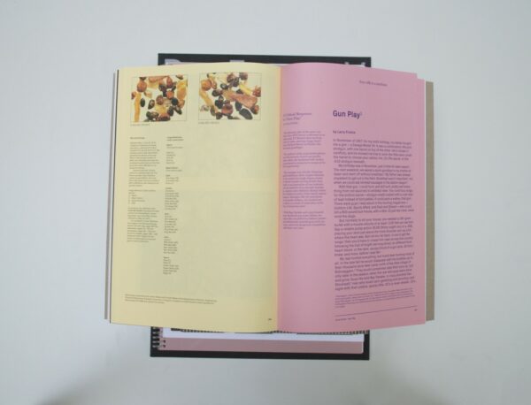
Auke: This book also had my undivided attention. There is so much to discuss about this book. Maybe this is the kind of book you don’t fully understand at first sight, and perhaps you will never understand why some decisions were made. But in this case, I don’t mind it. It adds to the investigative feel of the book. All of the elements are there. Take the title, War Sand, plus the given information and images, and you can get lost in thought from there. I especially like the yellow section. It works really nicely with the images – very sandy. You could argue it looks clumsy, but at least it rocks it.
- Auteur
- Donald Weber
- Oplage
- 700
- Omvang
- 372
- Prijs
- 69
- ISBN
- 978 0 9959377 0 3
- Uitgever / Opdrachtgever
- Polygon, Amsterdam
- Ontwerper(s)
- Heijdens Karwei, Amsterdam (Teun van der Heijden)
- Drukkerij
- Grafiplaza, Amsterdam
- Lithograaf
- Colour & Books, Apeldoorn (Sebastiaan Hanekroot)
- Boekbinderij
- Binderij Hexspoor, Boxtel
- Materiaal
- Paper for interior: 150gsm Magno Volume (Igepa), 90gsm Magno Gloss (Igepa), 70gsm Plano Plus (Papyrus), 80gsm RecyStar Color Hellrosa (Papyrus), 80gsm RecyStar Color Chamois (Papyrus), 120gsm Pop’Set Spring Green (Antalis), 140gsm Tintoretto Gesso (Fedrigoni). Cover: 300gsm Invercote G (Igepa). Dust jacket: 280gsm Kraftliner (Koninklijke Moorman Karton) with blind debossing by KuiperDonse foliedruk & grafische nabewerking, Utrecht.
- Bindwijze
- sewn Otastar
- Lettertype
- Px Grotesk (Optimo Type Foundry), Miller (Font Bureau)
- Technische Bijzonderheden
- The top edges of three sections are folded, enclosing an unmounted map, zigzag folded in four.


