the absence of sound
the absence of sound
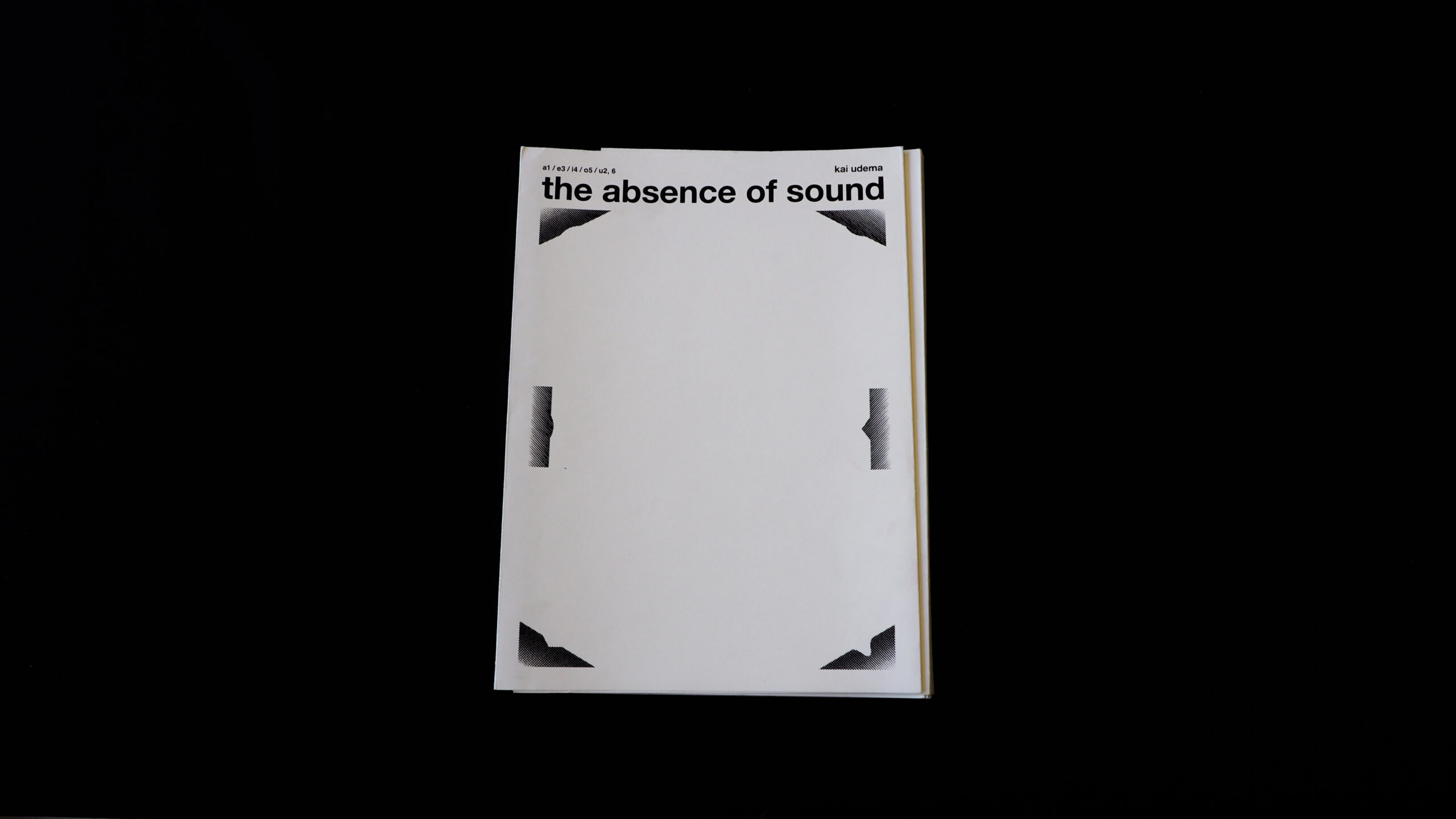
This rather strange book, joined by a black plastic spiral that almost makes one think at first of an unintentional choice, caught our attention for its originality, which clearly distinguishes it from the other books of the selection.
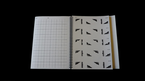
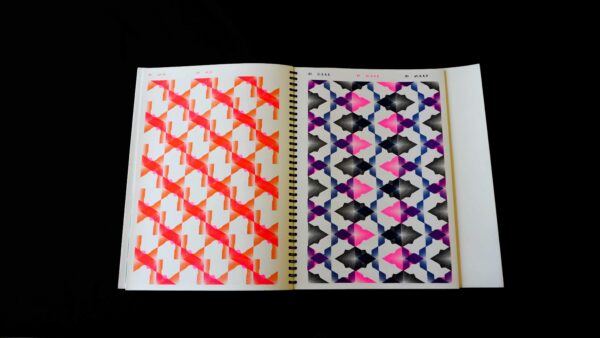
It is the work of a graphic design student who has devoted himself to the development of a typeface made up of various geometric shapes. Indeed, the book looks like a catalogue of forms. The shapes displayed in it are glyphs from the typeface, meaning each page is typed. The book shows an extensive overview of the different possibilities of these shapes, creating very interesting patterns.
It is printed with a Riso printer in 9 different colours/toners. The paper chosen is thick, which gives solidity to the object. Holding the book is a bit tricky because of the binding and the shape of the cover, but the whole work has a very coherent and solid appearance.
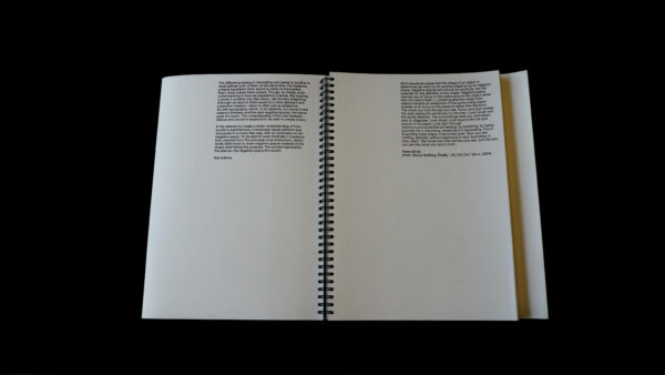
The jury rather regrets the lack of explanations of the student’s project and maybe also the typographical choice that may be considered to be too obvious for the text.
- Auteur
- Kai Udema
- Oplage
- 12
- Prijs
- 40 euro
- Verschijningsdatum
- Januari 2016
- Ontwerper(s)
- Kai Udema, Arnhem
- Drukkerij
- Amsterdams Grafisch Atelier, Amsterdam
- DTP / Zetterij
- Kai Udema, Arnhem
- Boekbinderij
- Copy Kronenburg, Arnhem
- Materiaal
- Interior: Lessebo Design Naturel 240 g/m² (Igepa Tiel, sponsored by Uitgeverij De Buitenkant).
- Lettertype
- Helvetica Bold
- Technische Bijzonderheden
- Entirely Risograph in 9 separate colours. Handmade. Cover manually silkscreened.
(Student) Academy: ArtEZ University of the Arts, Arnhem. Graduation year: 2017 (Expected).
Explanation: The shapes displayed in the book are represented in a typeface, meaning each page is typed. The book shows an extensive overview of the possibilities of these shapes.
