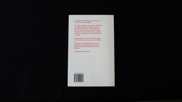
Ode aan de liefde (Ode to Love)
Ode aan de liefde (Ode to Love)
Ode aan de liefde is a pocket-size book which contains texts written by the French philosopher Alain Badiou which discuss the economic theories of human emotional nature replaced with interaction and relationships. This clever decision about the size makes the content easier to absorb.
In this book Badiou describes and analyses his vision on love and in what way people are afraid of it. He gathers fields such as philosophy, truth, art and politics together and their influences.
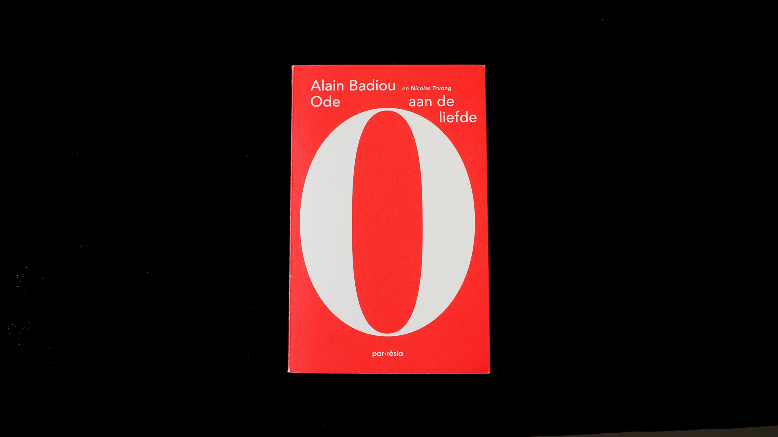
This book has a strong typographic design on the outside, printed on a soft cover which presents the high contrast of the letter ‘O’ empowered with red (which in this case refers to the colour of love) and white, which makes the best contrasting combination.
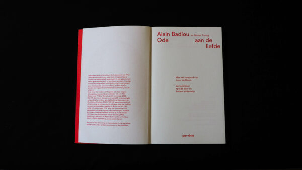
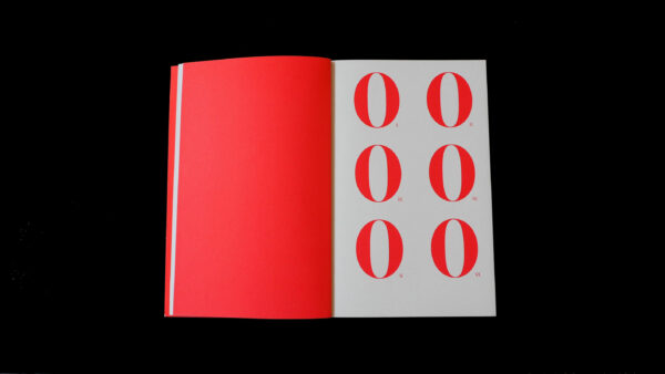
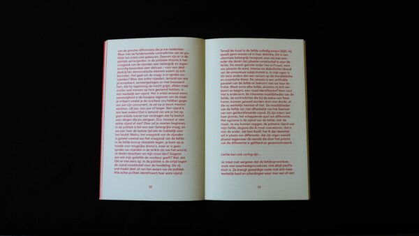
You can see evidence of a consistent implementation of the concept. Clearly designed spreads create a good impression of readability and typographic choices — such as structured text, font size, line width and length or word division — this creates a feeling of easy and clear access to the content. At the same time look at the playfulness of the layout, composition, text design, and use of red colour, which makes it very interesting and outstanding. Good quality is very easily noticeable.
Overall, it’s well done work, presenting and clearly reflecting the language which the writer uses.
- Auteur
- Alain Badiou, Nicolas Truong
- Serie
- Yes
- Oplage
- 1,000
- Omvang
- 96
- Prijs
- 15.95 euro
- ISBN
- 978-90-73040-11-3
- Verschijningsdatum
- March 2016
- Uitgever / Opdrachtgever
- Parrèsia, Amsterdam
- Ontwerper(s)
- Janna Meeuw and Hilde Meeus (Meeusontwerpt), Amsterdam. Stien Stessens, Gent.
- Drukkerij
- Bariet, Steenwijk
- Boekbinderij
- Bariet, Steenwijk
- Materiaal
- Interior: Munken Print White, 100 g/m² (Arctic Paper). Cover: Biotop, 250 g/m².
- Lettertype
- Avenir Lt (Linotype)
- Technische Bijzonderheden
- Koudlijm, omslag met flappen, geheel gedrukt in 1 pms kleur - pantone 032 Red
