INLAND Volume: Publishing Class V
INLAND Volume: Publishing Class V
INLAND Volume: Publishing Class V is a collective project about art, agriculture, territory, social and cultural production.
The artists involved in this project are Dutch Arts Institute – Publishing Class and Werkplaats Typografie students, who collaborated with INLAND Study Group and other contributors.
The content of the book highlights the problems of a system that is collapsing at environmental, cultural and financial levels, describing in those cases problems relating to the planet and the individual.
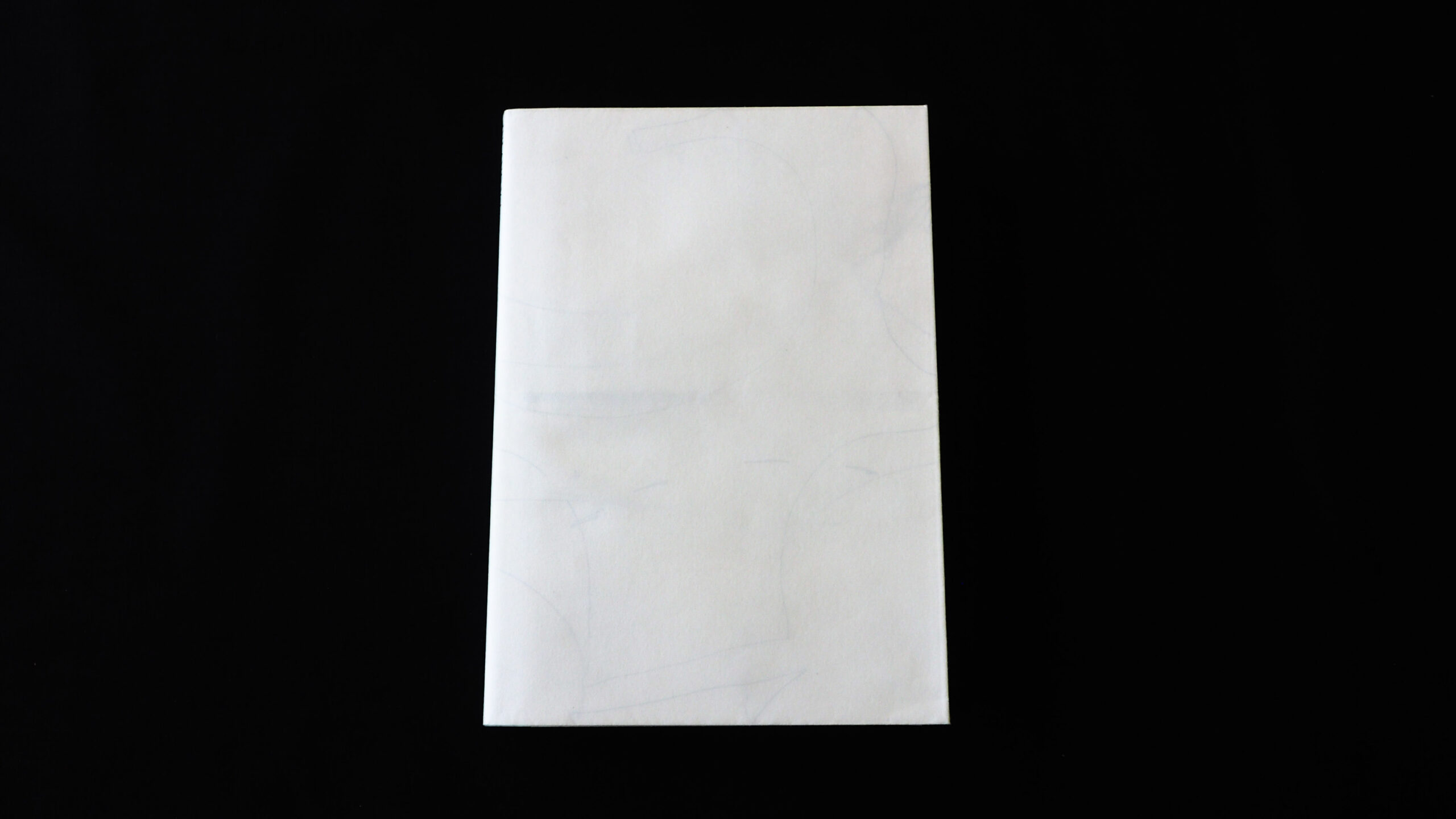
The book has an immediately noticeable identity. Before opening INLAND your attention focuses on the book’s jacket, which is matt and white on the outside. At the same moment, when you take the jacket off, you can see on the inside of the varnished paper, a mind map with an explanation about how to read the book.
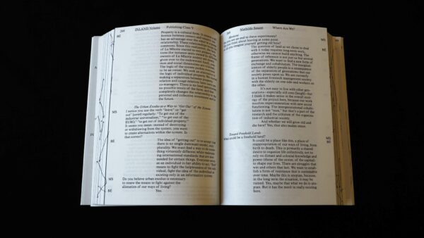
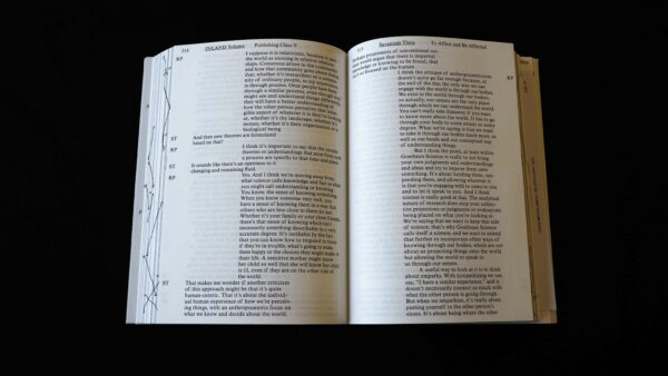
INLAND is almost entirely white, containing dark grey tone drawings with pictures printed in black-and-white, scanned drawings and notes. It doesn’t look bland. The presented texts, notes, illustrations and sketches express the spirit of the book which is not puffy or tight but rather the opposite.
In an organised way you are able to follow the ideas and research conducted by the students. Still, because of the edgy and playful layout you feel more invited to continue reading through the content.
The choice of typography and navigation design is great, it is another proof of the consistency of the decision made while designing.
The design concept of this book is interesting, as well as the good opacity of the content, quality of print, and readability.
The overall impression is very good, mainly because of the relation of content versus execution and the form in which it is presented.
The concept seems to be designed in an easy to understand manner, and also the format and weight are a deliberate choice.
- Auteur
- Fernando Garcia-Dory, Sanne Oorthuizen
- Oplage
- 400
- Omvang
- 456
- Verschijningsdatum
- May 2016
- Uitgever / Opdrachtgever
- Dutch Art Institute
- Ontwerper(s)
- Ronja Andersen, Nerijus Rimkus, Josse Pyl, Arnhem en Amsterdam
- Fotograaf
- Deelnemende kunstenaars
- Drukkerij
- Drukkerij Robstolk, Amsterdam
- DTP / Zetterij
- Ronja Andersen, Nerijus Rimkus, Josse Pyl, Arnhem en Amsterdam
- Lithograaf
- Drukkerij Robstolk, Amsterdam
- Boekbinderij
- Boekbinderij Patist BV, Den Dolder
- Materiaal
- Interior: Munken Polar Rough 90 g/m² (Antalis). Cover: Munken Polar Rough 170 g/m² (Antalis), Chromolux 700 1Z, 80 g/m² (Papyrus).
- Technische Bijzonderheden
- 1/1 zwartgedrukt in HR UV offset, zeefdruk op snee (door Aldoscreen).


