MARJAN TEEUWEN. DESTROYED HOUSE
MARJAN TEEUWEN. DESTROYED HOUSE
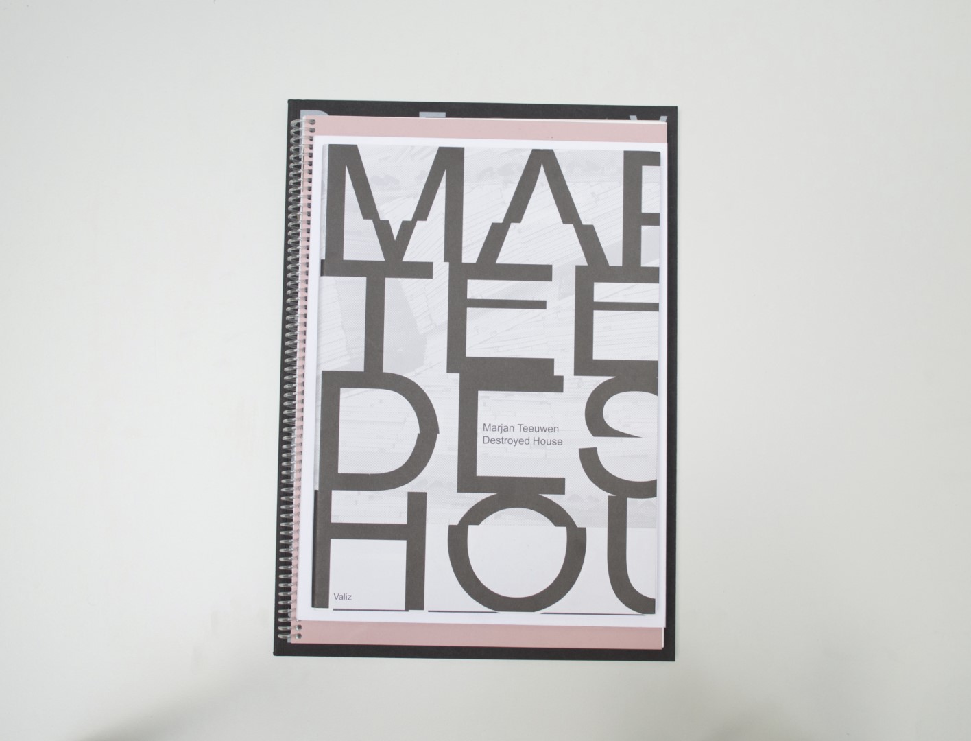
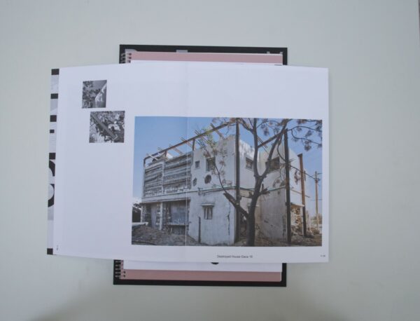
Ruby: Marjan Teeuwen’s Destroyed House shows us deconstructed houses which have been stripped of most of their features and in which only the core remains. Her large images are serene and placed carefully on white pages. They are alternated by pages with text. Even though I think the typography pages are quite heavy on the eye, I can see why they chose to do it in that way. It refers to the layered blocks and bricks that the destroyed house exposes. I also find the placement of the images quite refreshing. In our selection there are some other books that used the same image-placement solutions, such as De Gestiek van de Architectuur. The difference is that Destroyed House is more of a photography book, whereas De Gestiek van de Architectuur is more text-based.
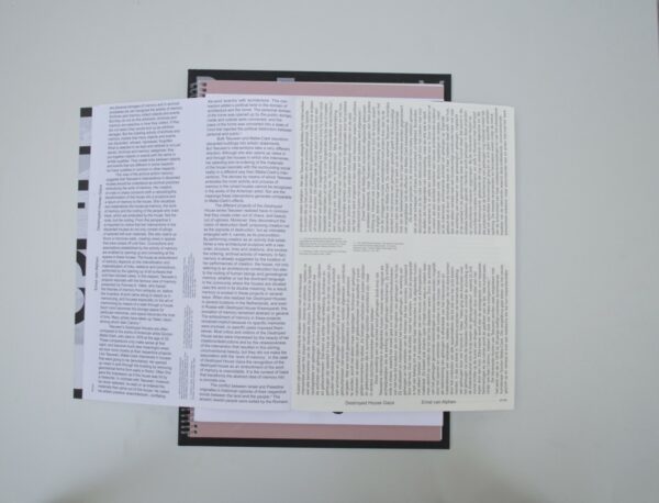
Auke: The book becomes an interactive play because of the text placement (at least when you’re reading Dutch). You’ll have to turn this big book 90 degrees in order to read the text, which unconsciously makes you analyze the pictures from another perspective. The structures in the pictures are so alienated and almost unreal, they work no matter which way you look at it.
Birgit: I really liked how the text placement referenced the way the blocks and bricks were placed as well. The larger size of the book also felt really fitting to the context. I remember our discussion about the cover of the book. Solely consisting of typography, the title on the cover also references the context of building blocks. To some of us this felt overdone; to others it felt just right.
Patrick: I actually think that the cover does not quite fit the interior; it is a bit too much. The typography in the book, as Auke says, makes you turn the book and view the images from a different angle. Personally, I am a fan of the large spacing of the columns. This creates a unique image and provides space for the references.
- Auteur
- Marjan Teeuwen
- Oplage
- 1400
- Omvang
- 160
- Prijs
- 29,50
- ISBN
- 978 94 92095 37 4
- Uitgever / Opdrachtgever
- Valiz, Amsterdam
- Ontwerper(s)
- Haller Brun, Amsterdam
- Fotograaf
- Marjan Teeuwen (assisted by Ezz Al Zanoun, Peter Cox, Mike Harris, Koen Torny).
- Drukkerij
- Bariet Ten Brink, Meppel.
- Lithograaf
- Wilco Art Books, Amersfoort (Mariska Bijl)
- Boekbinderij
- Wilco Art Books, Amersfoort.
- Materiaal
- Paper for interior: 150gsm Munken Polar Rough (Antalis), 120gsm BIO TOP 3 (Antalis), 115gsm Cocoon Silk (Antalis), 140gsm PlanoPlus (Papyrus), 115gsm Arctic Volume Highwhite (Antalis), 120gsm Arcoprint Milk 1.5 (Fedrigoni). Cover: 280gsm Invercote G (Antalis). Dust jacket: 120gsm Munken Polar Rough (Antalis), matt laminated on the inside.
- Bindwijze
- Binding style: sewn soft cover with front and back cover of four pages sewn in, glued-off spine, fore-edge untrimmed.
- Lettertype
- Arial (Monotype)


