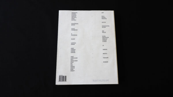
Rijksmuseum kookboek
Rijksmuseum kookboek
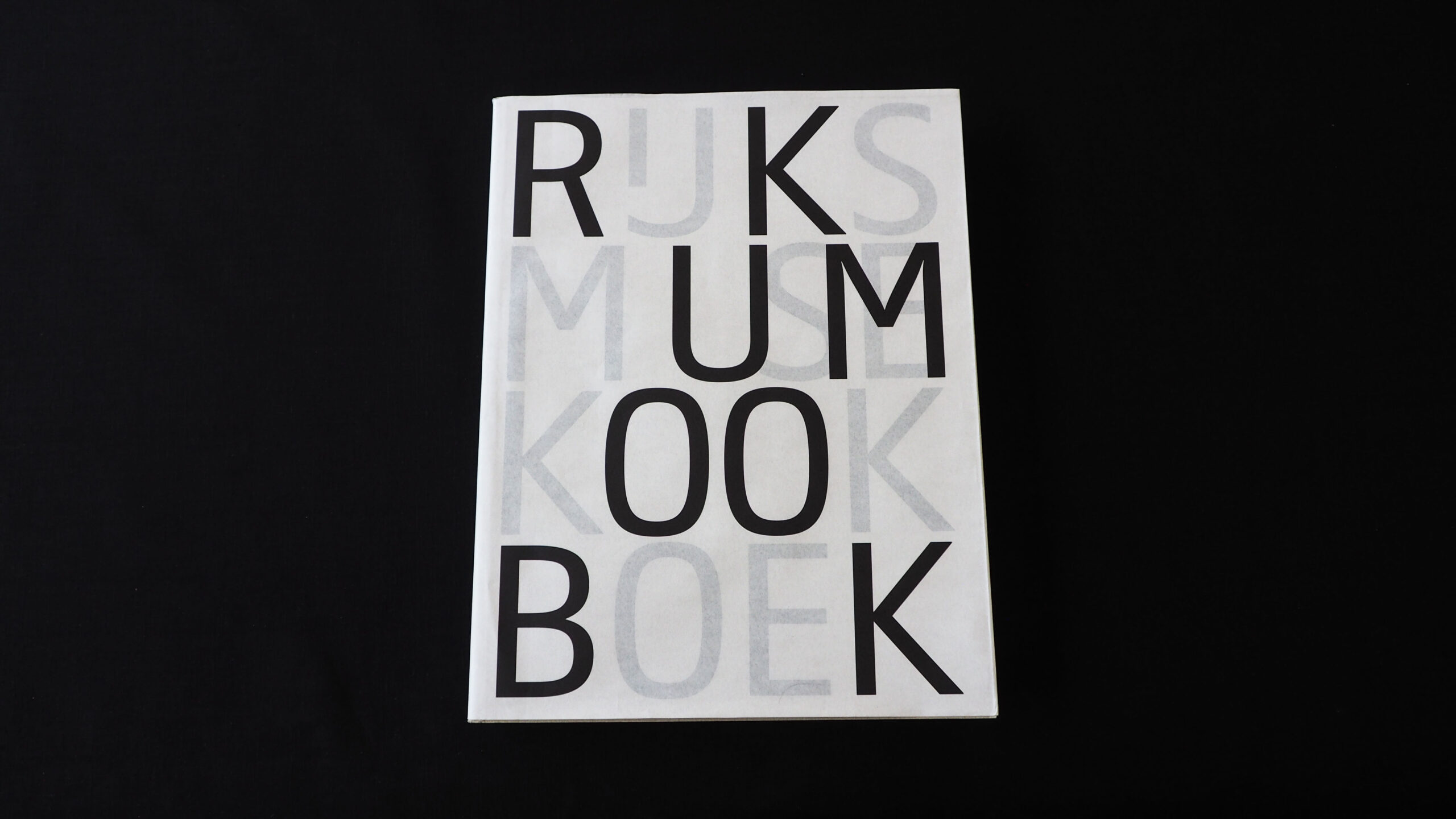
How the collective work of the past centuries by the most cherished Dutch artists leads up to a cookbook is as peculiar as the end result. Seen from within the genre of cookbooks this book is much more than a commodity. It’s weirdly interesting. By finding a way to incorporate her name on the cover Boom seems to blur the lines between themes as subjectivity and objectivity. Whatever it is, it’s there.
Dangling between a practical guide and a historical object we can imagine this book caters to the fun part of cooking without losing its status as a communication tool. This book differs from the average cookbook and is dead serious about the subject, which was surprisingly enjoyable for a book from this genre. It could just as well have been information design, especially because of the alphabetical order.
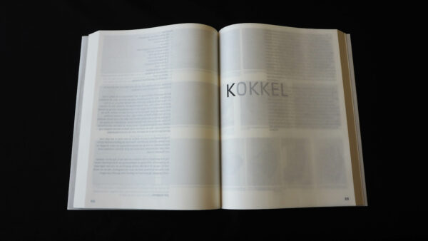
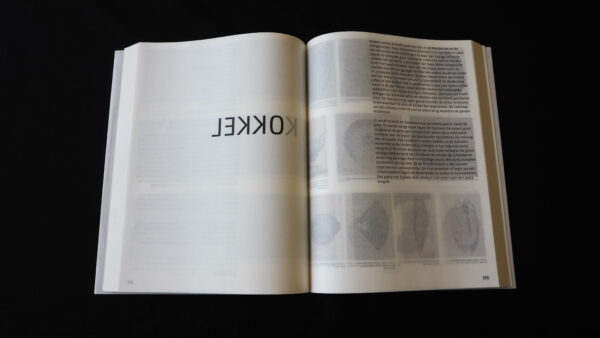
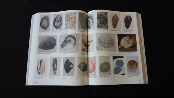
By using very thin paper (described as greaseproof paper) every page exposes some of the following content and the book becomes even more three dimensional. With this see-through effect Boom cleverly plays with the columns, images and text of the next page. The reader is made aware that the artworks are reproductions — supporting the text and vice versa — no longer meant to be an artwork. Pleasant to handle, fragile as well, but tactile as we expect from its designer. The price is good too.
- Auteur
- Jonah Freud
- Oplage
- 3,000
- Omvang
- 600
- Prijs
- 45 euro
- ISBN
- 9789082543704
- Verschijningsdatum
- June 2016
- Uitgever / Opdrachtgever
- Rijksmuseum / De Kookboekhandel
- Ontwerper(s)
- Irma Boom, Tariq Heijboer
- Fotograaf
- Afdeling beeld van het Rijksmuseum
- Drukkerij
- Zwaan printmedia, Wormerveer
- Lithograaf
- Irma Boom, Amsterdam
- Materiaal
- Interior: IBOONE 60 g/m². Cover: 290 g/m² Muskat Grey, IBO NBO 60 g/m².
- Lettertype
- Rijksmuseum (Paul van der Laan)
