In need of… Graduation 2016
In need of… Graduation 2016
The graduation book 2016 of the Design Academy Eindhoven includes students’ work in the design fields of identity, context, information, social, and more, besides fifteen texts and conversations, thus presenting its full range of 171 graduating talents in a unique book.
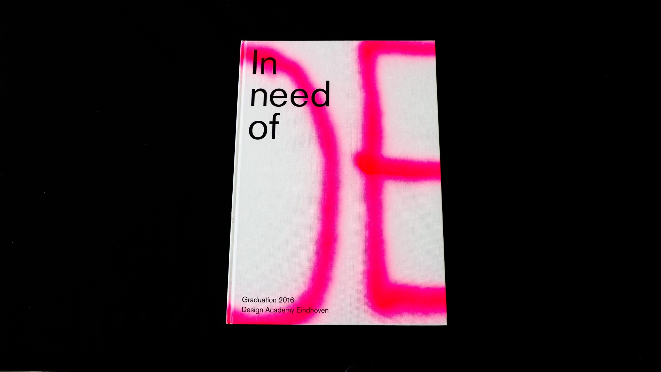
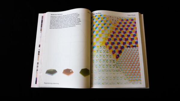
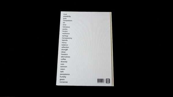
We can, first of all, notice the volume of the book, which is very pleasant, despite being heavy and imposing – the book needs to be put on a table to be read; then we can see an interesting contrast between the hard cover and the newsprint paper used for the pages inside, leaving a ribbed edge. The cover is made of hard cardboard, white, coated with hand- painted fluo pink paint spray. All the books wear a different fluo pink trace. The inside cover is made of light pink paper, a colour that is maybe a bit lacking in intensity.
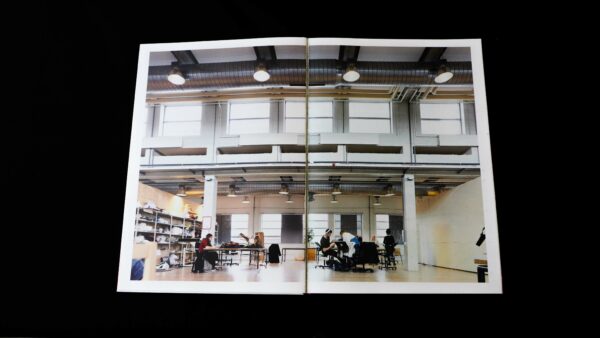
The design is clean, clear and legible, which is very appropriate for a graduation book. Each student project is illustrated by a photograph taken by the student himself, and here we can also underline the quality of these shots. Again, there is a perfect management of printing on newspaper: the colours of the images are beautiful, the typographic gray is perfectly balanced.
This book is thus a great success, combining efficiency and aesthetic proficiency.
- Auteur
- Design Academy Eindhoven
- Oplage
- 2,500
- Omvang
- 480
- Prijs
- 30 euro
- ISBN
- 9789491400278
- Verschijningsdatum
- October 2016
- Uitgever / Opdrachtgever
- Design Academy Eindhoven
- Ontwerper(s)
- Haller Brun
- Fotograaf
- Lisa Klappe, Nicole Marnati, Femke Reijerman, Ronald Smits
- Drukkerij
- Rodi Rotatie B.V., Robstolk
- Lithograaf
- Robstolk
- Boekbinderij
- Patist
- Materiaal
- Interior: UPM matt 60 g/m². Cover: Wibalin Buckram White 115 g/m² (Winter & Company).
- Bindwijze
- Cold-glue binding with flat spine. Thin boards with minimal square. The fore-edge has not been trimmed, thus leaving the serrated edges visible.
- Lettertype
- Berthold Akzidenz Grotesk Pro
- Technische Bijzonderheden
- Interior printed in waterless web offset. 2,500 unique covers were hand-sprayed using spray cans.


