Bryophetes and Lichens of Letterewe
Bryophetes and Lichens of Letterewe
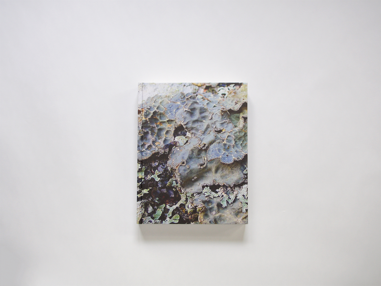
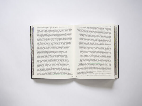
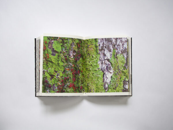
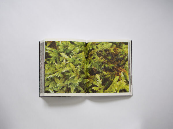
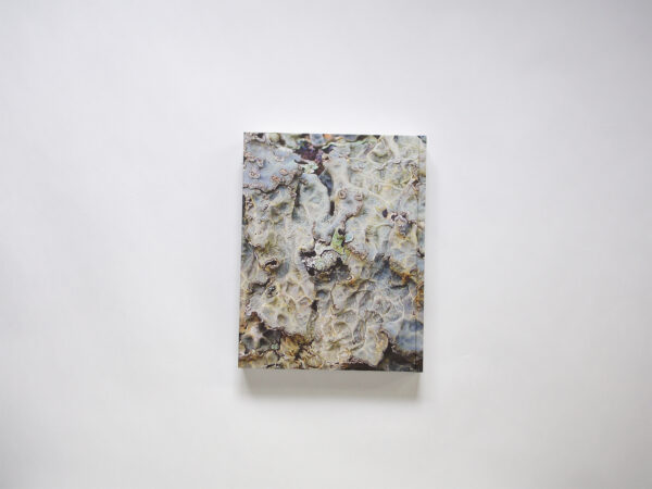
We have to admit there is a lot that appeals to us: the texture of the lichens is carried throughout the entire design. The grainy effect on the images and the choice of paper both prove texture to be of great importance. There is not much to say about the typography of the book other than that it’s beautifully done. Especially the placing of and choice of typeface on the spine. All in all a really well-designed book that we wanted to be in the selection, but with some notes on the side. The jury questioned the amount of design interventions in the book: the green underlining of specific words, the fluctuating alignment of the text, the textured edges of the pages and so on. We wondered if all of them were really needed. But then again, what is the right balance between functionality and aesthetically pleasing design elements?
- Ondertitel
- Het mos-boek
- Auteur
- Oliver Moore
- Serie
- Yes
- Oplage
- 300
- Omvang
- 344
- Verschijningsdatum
- October 2019
- Uitgever / Opdrachtgever
- Letterewe Estate (Achnasheen, Scotland)
- Ontwerper(s)
- Irma Boom Office (Amsterdam)
- Fotograaf
- Oliver Moore
- Drukkerij
- Zwaan Lenoir (Wormerveer)
- Lithograaf
- Zwaan Lenoir (Wormerveer)
- Boekbinderij
- Boekbinderij Van Waarden (Zaandam)
- Materiaal
- Paper interior: EOS 2.0, 100 grams
Paper end papers: Sirio zwart, 185 grams
Cover material: Wibalin natural white, 120 grams - Bindwijze
- Genaaid gebonden in harde band, met rechte rug en minimale oversteek
- Lettertype
- Plantin MT Pro (Regular – Italic), Times (Italic), Arial (Regular – Bold – Italic)
- Technische Bijzonderheden
- De beelden zijn gedrukt in een heel grof raster, 65 lpi, ongeveer raster 26.