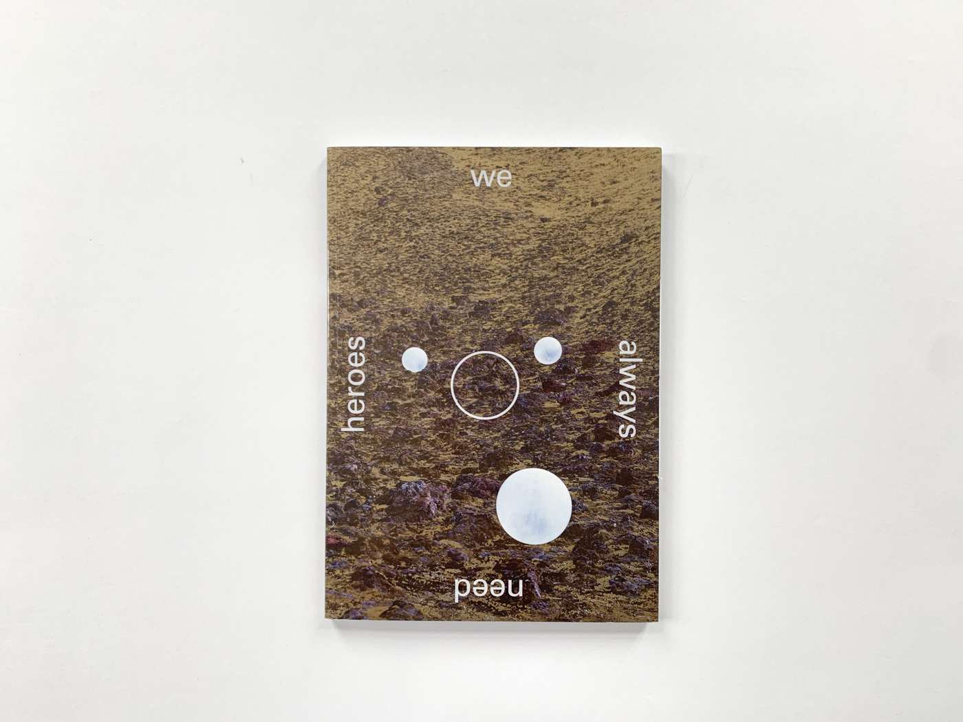
We Always Need Heroes
We Always Need Heroes
This book deals with so many things that it is remarkable how complete, balanced and continuous it turned out.
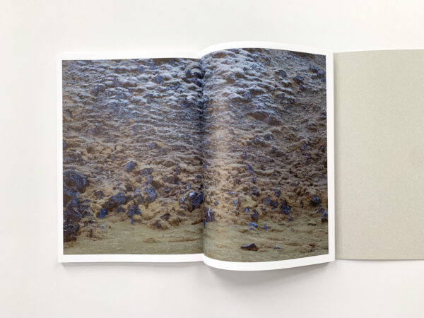
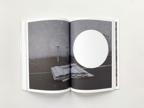
But also, if we look at the cover, imagery, musical notation and text separately, they all co-exist independently thanks to the high quality of their execution. The use of multiple mediums becomes primarily visible in the notation system presented in the book where the focus lies on the variety of ways the narrative is told during the interviews the artist held. This experimental way of writing brings a fresh visual aspect to the layout of the book. Circles and gold are main elements and these come back in both text and images in the book. An appealing detail and conceptual method is the CMYK offset colors that are used. The yellow is replaced by gold and there are perforated holes in the book that have multiple functions. Maybe not highly unique but it does fit well with the research content about the financial crisis. It is a beautiful documentation of the part of Iceland it is inspired by and of the voices of the people living there.
- Auteur
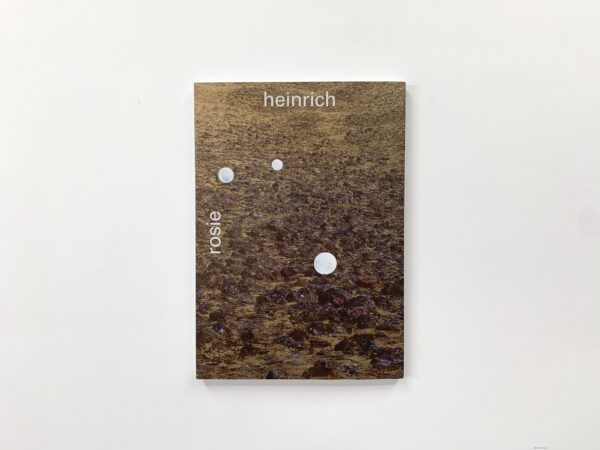
- Rosie Heinrich
- Oplage
- 750
- Omvang
- 136 + 8 (inlay)
- Prijs
- €30
- ISBN
- 978 94 90119 66 9
- Uitgever / Opdrachtgever
- Fw:Books, Amsterdam
- Ontwerper(s)
- Hans Gremmen, Amsterdam
- Fotograaf
- Rosie Heinrich, Sjoerd Knibbeler
- Drukkerij
- Grafiplaza, Mijdrecht
- Lithograaf
- Marco Kokkelkoren, Amsterdam
- Boekbinderij
- Boekbinderij Patist, Den Dolder
- Materiaal
- 135gsm Lessebo Design Smooth White 1.2 (Igepa), 90gsm (inlay) en 120gsm Munken Polar Rough (Antalis)
- Bindwijze
- Sewn soft cover with flaps, inlay fixed in front flap using a centre stitch
- Lettertype
- Univers (Linotype), Plantin (Monotype)
- Technische Bijzonderheden
- Interior contains a typographic/phonetic/intonation-based script developed in-house in which the text is set; the perforations (laser-cut by ID Laser) are part of this. A couple of images are printed in gold instead of yellow (CM-GOLD-K)
This book deals with so many things that it is remarkable how complete, balanced and continuous it turned out.
But also, if we look at the cover, imagery, musical notation and text separately, they all co-exist independently thanks to the high quality of their execution. The use of multiple mediums becomes primarily visible in the notation system presented in the book where the focus lies on the variety of ways the narrative is told during the interviews the artist held. This experimental way of writing brings a fresh visual aspect to the layout of the book. Circles and gold are main elements and these come back in both text and images in the book. An appealing detail and conceptual method is the CMYK offset colors that are used. The yellow is replaced by gold and there are perforated holes in the book that have multiple functions. Maybe not highly unique but it does fit well with the research content about the financial crisis. It is a beautiful documentation of the part of Iceland it is inspired by and of the voices of the people living there.
- Auteur
- Rosie Heinrich
- Oplage
- 750
- Omvang
- 136 + 8 (inlay)
- Prijs
- €30
- ISBN
- 978 94 90119 66 9
- Uitgever / Opdrachtgever
- Fw:Books, Amsterdam
- Ontwerper(s)
- Hans Gremmen, Amsterdam
- Fotograaf
- Rosie Heinrich, Sjoerd Knibbeler
- Drukkerij
- Grafiplaza, Mijdrecht
- Lithograaf
- Marco Kokkelkoren, Amsterdam
- Boekbinderij
- Boekbinderij Patist, Den Dolder
- Materiaal
- 135gsm Lessebo Design Smooth White 1.2 (Igepa), 90gsm (inlay) en 120gsm Munken Polar Rough (Antalis)
- Bindwijze
- Sewn soft cover with flaps, inlay fixed in front flap using a centre stitch
- Lettertype
- Univers (Linotype), Plantin (Monotype)
- Technische Bijzonderheden
- Interior contains a typographic/phonetic/intonation-based script developed in-house in which the text is set; the perforations (laser-cut by ID Laser) are part of this. A couple of images are printed in gold instead of yellow (CM-GOLD-K)