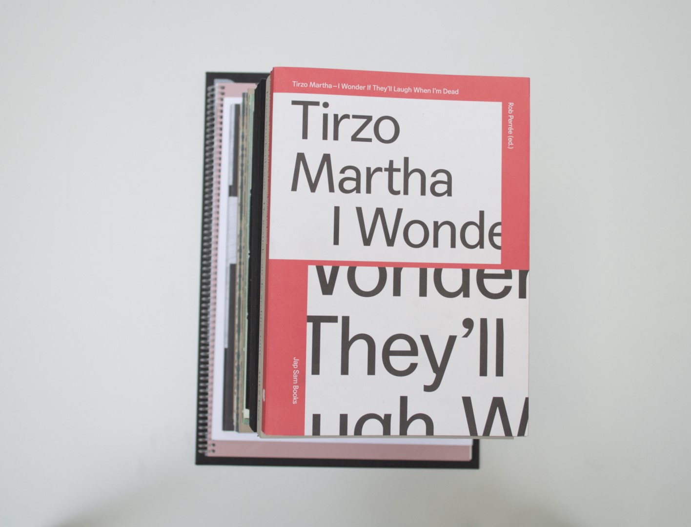
TIRZO MARTHA. I WONDER IF THEY’LL LAUGH WHEN I AM DEAD
Tirzo Martha
TIRZO MARTHA. I WONDER IF THEY’LL LAUGH WHEN I AM DEAD
Tirzo Martha
Birgit: I like how this book is like a puzzle. When first browsing through it I see a lot happening and am not completely sure why some choices are made. But as I take some time to find out more about the book, more and more small details that are quite well found become clear. Chapeau!
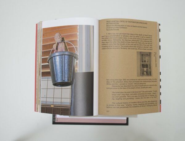
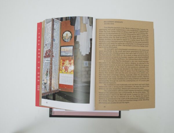
Ruby: One of the jury members pointed out something very interesting when speaking about the book, a point that I had completely missed. The sculptures or installations of Tirzo Martha are large and elaborate with many different details, quite like an organised mess. The way the book is designed – very tight and with a rigid grid – guides you to look at Martha’s works in a structured way.
Auke: That’s some Swiss set typography, very decent. Good paper choice, which brings a nice balance! The brown tactile craft paper with black typography is really calm and nice to read. Contradicting the work of Tirzo Martha with a lot of information and details to discover printed on the satin paper. A fun collaboration between,I think, a very structured design studio and a free-working artist. Both parties nicely come out together in this book.
- Auteur
- Rob Perrée (ed.)
- Oplage
- 1000
- Omvang
- 304
- Prijs
- 29,50
- ISBN
- 978 94 90322 88 5
- Uitgever / Opdrachtgever
- Jap Sam Books, Heijningen (Eleonoor Jap Sam)
- Ontwerper(s)
- Mainstudio, Amsterdam (Edwin van Gelder, Patrick Sanders)
- Fotograaf
- Omar Martha, Kiem Loon ‘Elvis’ Chen, Crystal Boomgaart, Harold Martha
- Drukkerij
- Graphius, Gent (BE)
- Lithograaf
- Graphius, Gent (BE)
- Boekbinderij
- Graphius, Gent (BE)
- Materiaal
- Paper for interior: 90gsm Cairn Eco, Kraft (Christiaan Janssen), 90gsm UPM Sol Mat (Igepa). Cover: 325gsm Cairn Board, Natural Kraft (Christiaan Janssen). Dust jacket: 120gsm Cairn Eco, Natural White (Christiaan Janssen)
- Bindwijze
- Sewn soft cover with dust jacket glued to the spine
- Lettertype
- Agipo (RP Digital Type Foundry)
Birgit: I like how this book is like a puzzle. When first browsing through it I see a lot happening and am not completely sure why some choices are made. But as I take some time to find out more about the book, more and more small details that are quite well found become clear. Chapeau!
Ruby: One of the jury members pointed out something very interesting when speaking about the book, a point that I had completely missed. The sculptures or installations of Tirzo Martha are large and elaborate with many different details, quite like an organised mess. The way the book is designed – very tight and with a rigid grid – guides you to look at Martha’s works in a structured way.
Auke: That’s some Swiss set typography, very decent. Good paper choice, which brings a nice balance! The brown tactile craft paper with black typography is really calm and nice to read. Contradicting the work of Tirzo Martha with a lot of information and details to discover printed on the satin paper. A fun collaboration between,I think, a very structured design studio and a free-working artist. Both parties nicely come out together in this book.
- Auteur
- Rob Perrée (ed.)
- Oplage
- 1000
- Omvang
- 304
- Prijs
- 29,50
- ISBN
- 978 94 90322 88 5
- Uitgever / Opdrachtgever
- Jap Sam Books, Heijningen (Eleonoor Jap Sam)
- Ontwerper(s)
- Mainstudio, Amsterdam (Edwin van Gelder, Patrick Sanders)
- Fotograaf
- Omar Martha, Kiem Loon ‘Elvis’ Chen, Crystal Boomgaart, Harold Martha
- Drukkerij
- Graphius, Gent (BE)
- Lithograaf
- Graphius, Gent (BE)
- Boekbinderij
- Graphius, Gent (BE)
- Materiaal
- Paper for interior: 90gsm Cairn Eco, Kraft (Christiaan Janssen), 90gsm UPM Sol Mat (Igepa). Cover: 325gsm Cairn Board, Natural Kraft (Christiaan Janssen). Dust jacket: 120gsm Cairn Eco, Natural White (Christiaan Janssen)
- Bindwijze
- Sewn soft cover with dust jacket glued to the spine
- Lettertype
- Agipo (RP Digital Type Foundry)