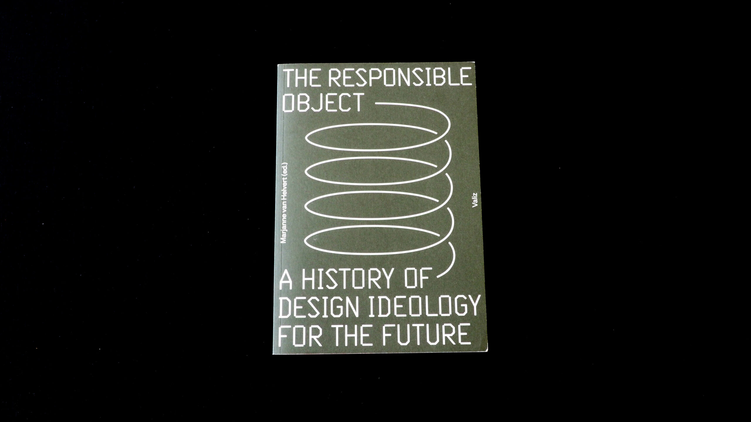
The Responsible Object: A History of Design Ideology for the Future
The Responsible Object: A History of Design Ideology for the Future
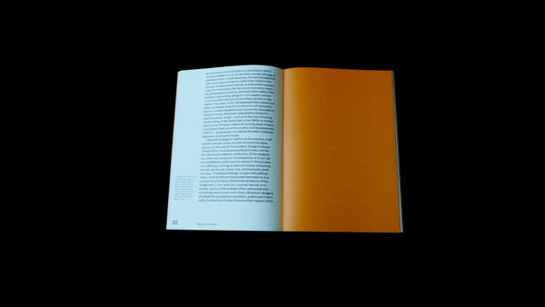
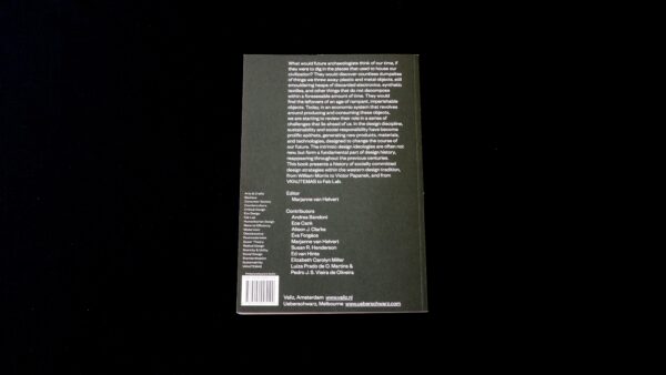
There is a very simple structure to this book about design strategies in the Western tradition, the style and flexibility of which struck a chord with the jury. Big typography might not be the best choice for a book whose backside mentions that ‘in the design discipline, sustainability and social responsibility have become prolific epithets’, but, that said, this 288-page long collection of essays contains a refreshing thought on how to systematically present a book in all the places where it may turn up. For this book the designer Ruber Pater designed an ‘activist’ typeface, which can be used for book presentations, programmes, etc. The orange pages throughout the book (which carry this typeface) offer an odd type of structure, which serves the content as a way to break the flow of reading and present quotes referring to the activist character of the book. It offers a nice rhythm without competing with the content, but (purposely or not) also makes you aware that activism may strike at any time.
Overall, the book feels light and nice to the touch. The soft colours work well with the choice of typography and the activist quality is expressed in a gentle way. This translation of content — closer to the essence of what the book is about — could have gone horribly wrong had the theme of activism been more vulgarly stated.
- Auteur
- Marjanne van Helvert (ed.), Andrea Bandoni, Ece Canli, Alison J. Clarke, Évan Forgács, Susan R. Henderson, Ed van Hinte, Elizabeth Carolyn Miller, Luiza Prado de O. Martins, Pedro J.S. Vieira de Oliveira
- Oplage
- 2,100
- Omvang
- 288
- Prijs
- 19.90 euro
- ISBN
- 9789492095190
- Verschijningsdatum
- October 2016
- Uitgever / Opdrachtgever
- Valiz, Amsterdam
- Ontwerper(s)
- Ruben Pater
- Drukkerij
- Ten Brink, Meppel
- Lithograaf
- Wilco Art Books (Mariska Bijl), Amersfoort
- Boekbinderij
- Ten Brink, Meppel
- Materiaal
- Interior: Munken Print White 1.5 80 g/m² (Antalis). Cover: Munken Pure 240 g/m² (Antalis).
- Bindwijze
- Unsewn soft cover (cold-glued)
- Lettertype
- Founder Grotesk (Klim Type Foundry), quotes designed by Ruben Pater
- Technische Bijzonderheden
- Quotes taken from the texts are spread evenly through the book on orange pages, creating a striped effect on the fore-edge. The reversed-out quotes themselves are in an ‘activistic' font created for them by designer Ruben Pater.


