Babel
Babel
Have you ever watched a movie in which the director made you fully aware of the fact that you were watching a movie and still managed to feel completely in the moment, so much so, that you needed to pause the movie for just a moment? Just recently, while watching The Shining (an American horror-movie from 1980) with a few friends in our shared studio, a clever, still unknown person got the idea to loudly bang on the door, scaring the living hell out of five guys at just the right moment. He was fully aware of what he was doing, he knew exactly the reaction he would trigger and that by running away he would leave us with that lingering feeling of ‘what the fuck happened’. One action at just the right time can leave a lasting impression.
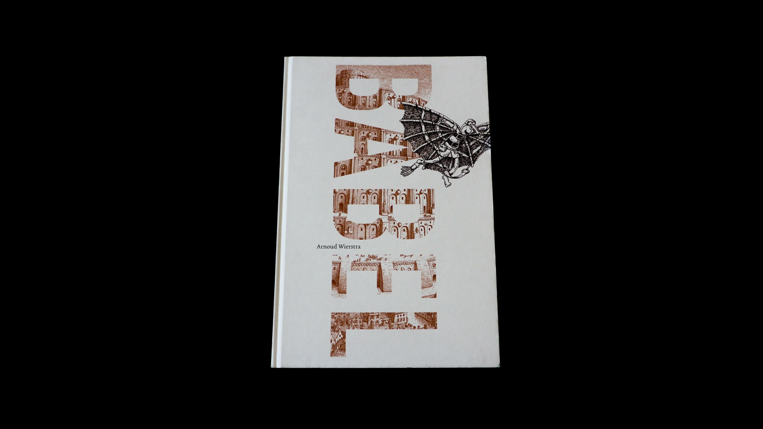
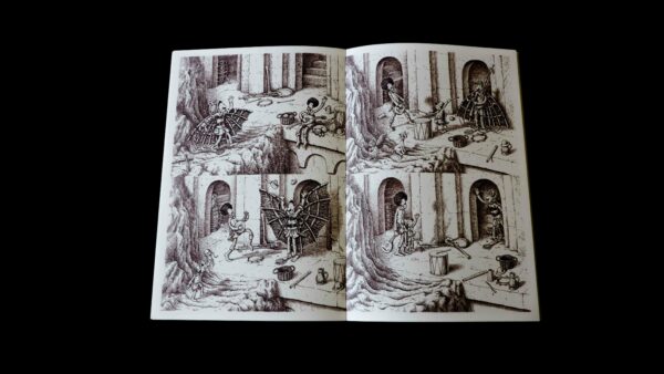
Babel felt like it was trying to achieve the exact same thing. This children’s book by Arnoud Wierstra based on The Tower of Babel by Pieter Bruegel the Elder plays with expectations. At the decisive moment in the story the reader is confronted with the inspiration for the story itself, breaking with the style, colour and visual language of the illustrations. A bold choice when you consider that among the many children’s books that were sent in very few dare confront children with the complexity of the world of grown-ups without dumbing it down. Often kids seem treated as if in need of simple answers to prepare them for adulthood (think for example about what the French philosopher Roland Barthes mentions in his essay Toys). Babel seems to accomplish the opposite. Clever and unpretentiously playing with the book as an object, knowing at what point on the page a chapter needs to end and when to introduce style changes in order to give the story more depth, without the use of explanatory typography.
This self-referential wink shows how the right design-choices can be simple but layered at the same time, and that an audience doesn’t have to be treated as the lowest common denominator in order to get your message across.
- Auteur
- Arnoud Wierstra
- Oplage
- 3,000
- Omvang
- 48
- Prijs
- 16.95 euro
- ISBN
- 9789025765514
- Uitgever / Opdrachtgever
- Gottmer Uitgevers Groep
- Ontwerper(s)
- Bockting Ontwerpers, Amsterdam
- Drukkerij
- INK69
- DTP / Zetterij
- Bockting Ontwerpers, Amsterdam
- Lithograaf
- Grafimedia, Amsterdam
- Materiaal
- Interior: 130 g/m² Munken Lynx (Arctic Paper).
Have you ever watched a movie in which the director made you fully aware of the fact that you were watching a movie and still managed to feel completely in the moment, so much so, that you needed to pause the movie for just a moment? Just recently, while watching The Shining (an American horror-movie from 1980) with a few friends in our shared studio, a clever, still unknown person got the idea to loudly bang on the door, scaring the living hell out of five guys at just the right moment. He was fully aware of what he was doing, he knew exactly the reaction he would trigger and that by running away he would leave us with that lingering feeling of ‘what the fuck happened’. One action at just the right time can leave a lasting impression.
Babel felt like it was trying to achieve the exact same thing. This children’s book by Arnoud Wierstra based on The Tower of Babel by Pieter Bruegel the Elder plays with expectations. At the decisive moment in the story the reader is confronted with the inspiration for the story itself, breaking with the style, colour and visual language of the illustrations. A bold choice when you consider that among the many children’s books that were sent in very few dare confront children with the complexity of the world of grown-ups without dumbing it down. Often kids seem treated as if in need of simple answers to prepare them for adulthood (think for example about what the French philosopher Roland Barthes mentions in his essay Toys). Babel seems to accomplish the opposite. Clever and unpretentiously playing with the book as an object, knowing at what point on the page a chapter needs to end and when to introduce style changes in order to give the story more depth, without the use of explanatory typography.
This self-referential wink shows how the right design-choices can be simple but layered at the same time, and that an audience doesn’t have to be treated as the lowest common denominator in order to get your message across.
- Auteur
- Arnoud Wierstra
- Oplage
- 3,000
- Omvang
- 48
- Prijs
- 16.95 euro
- ISBN
- 9789025765514
- Uitgever / Opdrachtgever
- Gottmer Uitgevers Groep
- Ontwerper(s)
- Bockting Ontwerpers, Amsterdam
- Drukkerij
- INK69
- DTP / Zetterij
- Bockting Ontwerpers, Amsterdam
- Lithograaf
- Grafimedia, Amsterdam
- Materiaal
- Interior: 130 g/m² Munken Lynx (Arctic Paper).